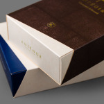
Antéoise by UMA
Antéoise is a creme dacquoise range from Anténor, a Japanese patisserie established in 1966 that creates French style cakes, cookies, tarts and variety of other confectionery. Antéoise’s brand identity and packaging treatment, developed by Osaka based graphic design studio UMA, draws on the range’s flagship positioning, high quality ingredients and the craft employed in its creation, the heritage and experience of Anténor, the streets of Kobe, and the...
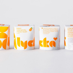
Lycka by BVD
Lycka is a 100% natural hand filled frozen yoghurt brand from Germany that donates 11 cents from each sale to Welthungerhilfe, a humanitarian aid project tackling issues such as world hunger, land grabbing in Cambodia and displacement across Syria and Iraq, amongst many other issues. Lycka’s brand identity and packaging, a mix of bright geometric forms which appears to draw some of...
Junction Moama by Seesaw
Junction is a bar and restaurant situated within the tourist district of the Australian twin-towns of Moama and Echuca, both of which have histories that began in the middle of the 19th century and grew to share a border along the Murray River. Originally a wooden tavern built by James Maiden in 1840, and named the Junction Inn – a reflection of...
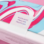
Costèllo + Hellerstein by Robot Food
Yvonne Costello and Ori Hellerstein are a husband and wife team making artisanal chocolate truffles using high quality ingredients and the processes acquired by Ori working as a pastry chef at well-respected restaurants. These skills were then refined whilst running his business The Artisan Bakery creating and supplying fine patisserie and chocolates to trade. Costello + Hellerstein’s philosophy is built around the complete sensory experience,...
Bryan Pearson by Strategy
Drawing on his extensive experience as a successful CEO, one that spans 20 years in the corporate, private and public sectors of New Zealand and Australia, Bryan Pearson has developed a niche business that provides strategic leadership and support to CEOs. His brand identity, created by design and advertising studio Strategy, is informed by the personal skills and experience that defines his business, and...
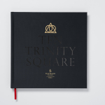
Ten Trinity Square by Pentagram
Ten Trinity Square is a super prime real estate project developed by the Chinese conglomerate Reignwood Group. It is made up of a private members club, residencies and a Four Seasons hotel, all set within the Port of London Authority building which is located at the centre of the city near the Tower of London and with views of the Thames....
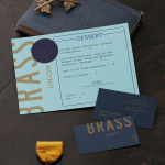
Brass Union by Oat
Located in the Union Square neighbourhood of Somerville, Massachusetts, Brass Union is a pub and cocktail bar with a small plate dinner menu. It takes over the space formerly occupied by the restaurant and music venue Precinct, both of which incorporated the historic nature of the building as a former police station into their names. To British readers, Brass Union would comfortably...
Woodland Wine Merchant by Perky Bros
Woodland Wine Merchant is described by Perky Bros, the design studio behind its new visual identity, as a tidy and eclectic wine store in Nashville, Tennessee that carefully curates wines from artisan producers practicing natural and sustainable methods, and hunts for and gathers the best value wines from around the world. Perky Bros’ identity solution was inspired by the collision of two worlds—the...
El Semillero by Anagrama
El Semillero is a large residential development program, managed by Fraterna, that intends to create a sustainable environment with expandable housing solutions based around basic needs and “economic flexibility” – presumably spaces that keep pace with current economic changes, improved social mobility and are accessible to a variety of income groups. Set at the heart of the Mexican city of Monterrey,...
Léon Courville Vigneron by lg2 boutique
Léon Courville is a Canadian vintner growing grapes and producing wine from a 18 hector vineyard surrounding his home near Ville de Lac-Brome, Quebec. The uniquely rocky, chalky and clay soil, the region’s later farming seasons and the warmth from Lac-Brome gives Léon Courville’s wine a distinctive flavour profile, one that has secured international recognition. As well as being interested in...
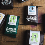
Torrefacto by Fork
Torrefacto is a Russian coffee roasting business founded in 2011 in response to what they describe as the difficulty of sourcing freshly roasted coffee beans in Moscow, and the time and trouble associated with importing it. Torrefacto prides itself on batch production and hand roasting processes, good consumer relations – which sees its owners personally answering letters and addressing website comments – and...
Austin Fraser by Felt
Austin Fraser is a UK information technology and engineering recruitment specialist with an open and transparent business practice. Established in 2007 it has gone on to win a variety of awards and recently opened its first international office in Munich with another office planned for Austin Texas this year. Described as dated, parochial and not reflective of Austin Fraser’s ability or ambition,...