Blue Mountains by For The People
The Blue Mountains of New South Wales, Australia are not technically mountains at all. They are, rather, a complex labyrinth of dissected plateaus, gorges and valleys of sandstone, formed over 50 million years ago. So far, so deceptive. Fortunately, however, the Blue Mountains are most definitely blue. When the atmospheric temperature of the region rises, a superfine mist of fragrant...

TWYG by Seachange
At some point over the past half decade or so, someone somewhere decided that vowels were profoundly uncool: see Anthropologie’s wedding line BHLDN; “virtual sneaker” brand [what?!] and Nike acquisition RTFK; Blndr (yes, it’s a blender) and the likes of Tumblr, Pixlr, and Flickr, which dared to sneak in just the one. Reading such words feels a bit like learning...
BP&O Voices
Rich Baird on Design History:
Spar by Raymond Loewy, 1970
The story of Raymond Loewy’s 1970 logo for Spar....
New York Botanical Garden by Wolff Olins
It must be something of a dream project when an agency gets commissioned to work on those big-name cultural clients – museums, art galleries, orchestras, theatre companies, et al. You’d expect such projects to be a departure from the constraints and stakeholder-limitations of corporate clients; and perhaps a chance to be more creative than usual, thanks to the nature of...
Knahia by Requena Office
Estepona is a Spanish resort town on the Costa del Sol. It surveys the azure waves of the Mediterranean from the apex of a bight that traces a gentle South-Westerly arc from Marbella to Gibraltar. Strewn as it is on this notoriously idyllic coastline, Estepona largely conforms to the stereotypically cheerful charm of the Spanish resort town, pandering to the...
Ami Ami by Wedge
We’ve all, at some point in life, encountered a few “But Actuallys”: the kind of people who always know a little bit more than you, constantly correct you, diligently fact check in social situations. They’re perennially just that smidgen More Right than you: a heady combination of The Simpsons’ Comic Book Guy; the classic pedant (or pendant if you want...
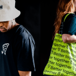
Be Equitable by For The People
There are many kinds of rebrand. There are rebrands that tread lightly, reverently refining and polishing what is already there, like archaeologists delicately exhuming sunken lucre so that it can once again gleam (National Portrait Gallery). Then there are rebrands that are a little more decisive in their handling of the raw materials—imagine our similetic Time Team creatively re-assembling the...
Mr Yum by Re Design
Sometimes a project comes along that doesn’t just make you think about how nice its typography is, or ponder if millennial pink is making a comeback (or indeed,, if it ever went away), or why suddenly a branded bucket hat seems to be a key facet of any company/product/concept’s ‘swag’. Sometimes, it makes you think about what ‘branding’ even means,...

Pirkkalan by Werklig
It’s been years since millennials were first accused of buying too many avocado toasts and expensive coffees. The stereotype of young people loving handmade, refined and artisanal products holds true in their spending patterns, and today, that generation has matured into business leaders, reshaping the world’s mindset to align with these priorities. As consumers, Gen Z seem to be picking...
Chilli Bomba by New Genre
Based in what’s been optimistically named London’s ‘Design District’, New Genre is a pretty youthful studio that’s racked up an impressively broad range of projects and clients in its short life. Just shy of two years old, the studio has thus far worked across fintech, a non-profit art organisation, a pub, a beauty brand, and a campaign for Jamie Oliver...
Omlet by Ragged Edge
We’re undeniably in an age of pet care 2.0: the post-fur-baby era, where people are finally beginning to see their animals’ needs and wants as independent to their own (i.e. dried pigs ears over vegan dog treats, eschewing leads for cats, and so on). These shifts in how we think about what it means to have and look after animals...
Kettle Kids by Two Times Elliott
The once laudable claim to have started a thriving business with ‘a small loan’ from a doting family member may have been muddied beyond recognition by the truth-stretching of serial tax-offender and part-time Presidential candidate Donald Trump. Despite this, turning ‘one thousand pounds from nan’ into a luxury watch and diamond dealership with a sparkling flagship store in Mayfair remains...