
Casa Malka by Nihilo
Branding agency Nihilo is more adept than most at shattering stereotypes – both in the work they make, and in terms of who the agency is, and what it’s all about. Founded by designer Emunah Winer and writer Margaret Kerr-Jarrett in Israel in 2021 and now based in Columbus, Ohio, the agency takes its name from the Latin term ‘creatio...
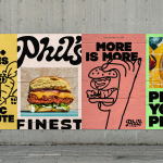
Phil’s Finest by Gander
It’s a moot point now that the last few years have seen an explosion in all things vegan and ‘plant-based’ (a term arguably used lightly, when you consider the ingredients in many no-meat, no-dairy, no-animal product alternatives). There’s vegan cheese that actually tastes nice, there’s mushroom and hemp ‘magic mince’, even vegan tuna. I’m writing this while eating a vegan...
Beams by Only Studio
The Beams is ‘an expansive new venue and event space on the Royal Docks in the heart of East London’ (that’s as long as you prefer your cartography loosely impressionist). Manchester-based Only Studio was tasked with branding the former Tate & Lyle sugar factory. The award-winning agency has previous form in the field of London industrial-eyesores-turned-cultural-juggernauts: it was also responsible...
Philharmonie Luxembourg by NB Studio
It is fair to say that rebrands of music organisations, of which there have been a number in the past few years, have benefitted from the recent explosion of graphic design into the world of sound and motion. Music has always inspired other forms of art, but these new digital tools are uniquely suited for producing design solutions for these...
BP&O Voices
Rich Baird on Design History:
Bandai by PAOS, 1983
The story of PAOS’ 1983 logo for Japanese toys and games company Bandai....
GUT by &Walsh
Guts aren’t exactly glamorous. And the connotations of the word ‘gut’ are multifarious: there’s the gory (‘blood and guts’); the Germanic ‘good’; the straightforwardly corporeal; or for those with an interest in newer psychological findings, it’s a wondrous ‘second brain’. Ad agency folk, however, have long taken the word ‘guts’ far outside of the bodily. For many of them, ‘guts’...
Upgrade to
BP&O Plus
Read more
Orchestra Sinfonica di Milano by Landor & Fitch
In the words of synesthete Johann Wolfgang von Goethe, ‘music is liquid architecture; architecture is frozen music’. Unlike 19th-century architecture, contemporary graphic design is afforded no such static reprieve – it faces the challenge of animating the ‘universal language’. Whereas once the plastic arts could content themselves with merely freezing music, any contemporary attempt to visually translate music must now...

Miles by Buddy Buddy
Deodorant isn’t traditionally a hotbed of innovation: for the most part, ‘women’s’ products don an unremarkable raft of white packaging (freshness!); blue, pragmatic type; and vague, rarely-kept promises about lasting for 72-hours. For the men, packs are sombre shades of black, dark blue, or grey (manly!) and just as drearily practical as the women’s. Deodorant, for the most part, has...
Paws Off! by Seachange
Anyone who’s ever had a dog, or just interacted with one, has likely spotted that over and above pretty much anything, food is the centre of their universe. Unfortunately for us, though, it’s not just dog-safe food that they’ll do whatever it takes to get their paws on: human food, it seems, often has the most appeal. But just as...
Marshmallow by Ragged Edge
A marshmallow is sweet, soft, pliable. Yet they are also resilient and surprisingly strong – who among us hasn’t enjoyed watching them perform surprisingly well under a hydraulic press compared to substances that much more obviously scream ‘structural integrity’? Perhaps this soft-yet-strong dynamic is why the name works for an insurance company. Or perhaps, more simply, the name works because...
Frydate by Skinn
Beyond its eye-wateringly strong beers, decadent chocolates, and waffles; Belgium is famous for serving up one beloved belt-buster that’s easy to eat, and deceptively hard to get right: chips. A new Belgian homemade burger and snacks offer, Frydate, positions itself far beyond a humble chippie and into the realm of ‘Belgian frymanship’-led ‘friterie concept’. To help it achieve its ‘insatiable...