Advertising
PAC NYC by Porto Rocha
There have been some brilliant logo designs inspired by the very buildings they represent. The Centre Pompidou, for instance, bears a powerfully stark logo that’s been largely unchanged since it was first created in the 1970s: six black stripes crossed by two zigzags representing the site’s ‘caterpillar’ escalator, one of the most famous parts of Renzo Piano and Richard Rogers’...

BP&O Voices
Paul Belford on Ads:
V&A print campaign
A guest article from Paul Belford on Saatchi & Saatchi’s print campaign for the V&A (1988). BP&O Voices presents the opinions of industry experts on a wide range of topics....
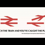
BP&O Voices
Paul Belford on Ads:
British Rail poster
A guest article from Paul Belford on Hedger Mitchel Stark’s poster for British Rail (1984). BP&O Voices presents the opinions of industry experts on a wide range of topics....