Alcohol Packaging
Pink! pink! everywhere!
Wine company Nice started life in 2019, and ever since, has aimed to be a far more straightforward alternative to the wildly confusing, jargon-packed, somewhat stuffy world of wine. In Nice’s words, the whole idea is to “liberate drinkers from wine headaches” both literal and metaphorical, “whether it’s inflexible packaging, confusing labels or next day regret”… Now after more than...
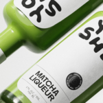
Yoshi by Saint-Urbain
Early days for sure, but this is hands down the best brand identity design I’ve seen this year – kudos to Saint-Urbain for once again putting a project out into the world that’s not only an absolute joy to look at, but which shows a razor-sharp nous for branding that’s both searingly zeitgeist and resolutely, timelessly future-facing. Said project is...
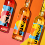
Wolfe Bros Cellos by OurCreative
The likes of Strawberry & Lime Kopparberg and Old Mout Cider (pronounced, either ‘moot’, or ‘mowt’, few know, few care coz that cute little kiwi bird is so distracting) are both, let’s face it, the semi-grown up, pretty acceptable face of alcopops: people order them at very normal (even gastro!) pubs and no one bats an eyelid – the same...
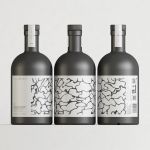
ITO Gin by Analogue
ITO Gin is first and foremost, brilliantly eyecatching – huge fluorescent letters, the epitome of ‘make it big’ when it comes to a brand name; deep black bottles – behind this bold exterior lies a narrative woven across cultures, histories, and generations. The brand was born of a collaboration between Komaki Distillery in Japan and UK-based gin brand Kokoro. However,...
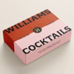
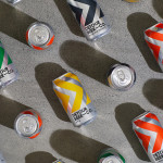
Williams Cocktails by Offff
In the last five years, canned cocktails have become ubiquitous, with offerings from MOTH: (packaging by Pentagram) and Whitebox (cans created in-house) among the strongest designs competing on the shelves of off-licenses, delis and bottle shops. Convenience and a post-pandemic demand for ‘on-the-go’ experiences have helped drive this trend, with Mintel data demonstrating that sales of spirit-based ready-to-drink beverages increased...
WEEKEND by FCKLCK
Who doesn’t love a cheeky cocktail, especially one designed to grab and go? According to WEEKEND drinks, its cocktails are eight times faster to serve than it would take to make the same mix from scratch. With ready-made drinks – that’s ‘RTD’ in marketing slang – becoming increasingly popular, WEEKEND aims to ‘cut through the noise’ with a ‘laid back...

The Gospel by DDMMYY
Not a new project, but one certainly worth revisiting; this work for whisky brand The Gospel scooped a fair few awards back in 2020, and it’s not hard to see why. The design agency behind everything from strategy and naming to brand story, creative direction, packaging design, and more is DDMMYY, based in Auckland, New Zealand. The team was initially...

Casa Malka by Nihilo
Branding agency Nihilo is more adept than most at shattering stereotypes – both in the work they make, and in terms of who the agency is, and what it’s all about. Founded by designer Emunah Winer and writer Margaret Kerr-Jarrett in Israel in 2021 and now based in Columbus, Ohio, the agency takes its name from the Latin term ‘creatio...
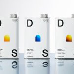
Departed Spirits by Marx Design
Maybe it’s been ‘silly season’ summer; maybe there’s a lack of risk-taking/imagination/budget; maybe I’m just jaded, but it’s felt as though recent months haven’t exactly seen a wealth of particularly exciting branding and packaging projects. That’s not to say there hasn’t been a steady stream of good work, but I’ve personally not felt hugely ‘wowed’: there’s been work that’s strong,...
Still Waters by Makebardo
There’s a drink for all occassions. Could be with friends, out at a bar, in a restaurant, perhaps alone. There are also drinks that you might expect to take you away from the everyday, perhaps to a quieter more tranquil place, where torrent of ice water meets the churn of the sea. Still Waters, a New Zealand distilled gin and...
Detour Beer Co. by Weave
Craft beer has become a hugely competitive market to enter. It seems a rather obvious thing to write, but it’s quite something to have been part of the generation that saw its rise. It’s also provided a lot of great imagery for design blogs, and moved freely between both brand building and just plain visual delight. To see large fridges within...
Pursue Hard Seltzer by OlssønBarbieri
New products, new markets and new consumer groups generate new aesthetics – or, at least, you would hope so. Too often, style migrates from one category to another, or the identity of a sub-culture (visually speaking), is exploited in a commercial context. This is where ‘authenticity’ emerges, to support genuine origin credentials, or to mask the appropriation with narrative context....