Beer Packaging
Double Diamond by Alec Tear
Our seemingly indefatigable fetishisation of the ghosts of branding past (i.e. why the design world is still talking about JKR’s Burger King rebrand nearly half a decade on) is perhaps little surprise: whether we’re consciously doing so or not, and to whatever extent we’re even aware we’re looking at something archival, returning to an amorphous yesteryear — real or imagined,...
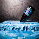
Still Waters by Makebardo
There’s a drink for all occassions. Could be with friends, out at a bar, in a restaurant, perhaps alone. There are also drinks that you might expect to take you away from the everyday, perhaps to a quieter more tranquil place, where torrent of ice water meets the churn of the sea. Still Waters, a New Zealand distilled gin and...
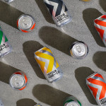
Detour Beer Co. by Weave
Craft beer has become a hugely competitive market to enter. It seems a rather obvious thing to write, but it’s quite something to have been part of the generation that saw its rise. It’s also provided a lot of great imagery for design blogs, and moved freely between both brand building and just plain visual delight. To see large fridges within...
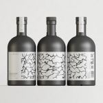
Omaka by Stockholm Design Lab
According to Sweden’s travel and tourism website, craft beer enthusiasts will discover a ‘smorgasbord’ of artisanal, eco-friendly and organic things to drink there, with more microbreweries per capita than any other country (apart from the UK). Omaka joined the scene in September 2020, at the height of the pandemic, and with a slogan to match its fearless attitude: ‘taste before...
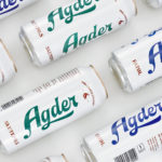
Agder Bryggeri by Frank
Agder Bryggeri is a well-regarded and historical name amongst breweries throughout Norway. It was first established in 1900 but was closed down in 1904 due to operational problems. Recently, the brewery has been resurrected as part of Norsk Bryggerier’s commitment to local beer brands, and is now sold throughout the Agder counties of southern Norway. As part of this resurrection...
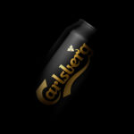
Carlsberg Black Gold by Kontrapunkt
Carlsberg is a Danish beer brand founded in 1847 by J.C. Jacobsen. It is part of the Carlsberg Group portfolio which also includes Tuborg, Kronenbourg and Somersby cider, as well as Carlsberg Export and Carlsberg Black Gold. Carlsberg has a significant heritage. And, like many other beer brands, has largely conveyed this using the visual language and associated legacy of the beer...
Brewdog Abstrakt by O Street
Brewdog’s Abstrakt is a limited edition craft beer concept that has released 20 different varieties since it began in 2010. Each beer is bottle-conditioned (bottled with a small amount of yeast, providing further fermentation and maturation), brewed and released just once, individually numbered and known only by their release code. It is a concept described as more art than beer, as boundary pushing and blurring...

Faculty Brewing Co. by Post Projects
Faculty Brewing Co. strives to create an open and collaborative environment where visitors, of all levels of expertise, can learn about how craft beer is made with the intention helping them to navigating Vancouver’s thriving craft scene. The brewery boasts a 7 barrel, 1450 square-foot brewery with 6 fermentors, 6 bright beer tanks and 28-seat tasting room with an industrial and utilitarian interior design. It also...
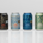
Fort Point Beer Co. by Manual
Fort Point is a San Francisco-based small batch craft beer company that references traditional styles yet is firmly rooted in the present, and has a philosophy that values craftsmanship and innovation, creativity and technique. In 2015, working with local graphic design studio Manual, Fort Point launched a new graphic identity and packaging system to unite its expanding range. Fort Point’s forward-thinking, fast-growing...
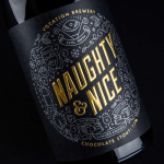
Vocation Brewery Limited Edition by Robot Food
Vocation is a UK microbrewery, established and run by John Hickling, with a range of craft beers described as having distinctive and punchy flavour profiles. Communicating the brewery’s unique personality and the crafted quality of its range rested in the hands of UK based graphic design studio Robot Food. Drawing on the beer’s tropical, fruity, floral and hoppy characteristics, the brewery’s fearless, daring and renegade attitude, and the...
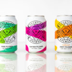
Vocation Brewery by Robot Food
Vocation is a UK microbrewery, established and run by John Hickling, with a range of craft beers that have distinctive and punchy flavour profiles, and a visual identity, packaging design and naming convention created by Leeds-based studio Robot Food. This draws on the tropical, fruity, floral and hoppy characteristic of the range, and the brewery’s fearless, daring and renegade attitude. This post was updated March...
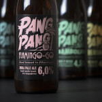
PangPang Summer Beer by Snask
PangPang is a Stockholm based microbrewery that was established by oddball Fredrik Tunedal in 2011. Fredrik, only 23 at the time, tattooed PangPang across his knuckles to celebrate the founding of what he believes to be Sweden’s first microbrewery. These knuckles now form the basis of the brewery’s logotype. Swedish design studio Snask were commissioned to develop a strategy for PangPang’s 2014 summer series...