Box Packaging
Pumpkin by Kuba & Friends
Another week, another branding project for those – love them or loathe them – ‘pet parents’. I honestly thought we were post-pet-parent, but seemingly we’re still very much in the midst of that icky phrasing – the “live, love, laugh” of dogs, a sort of endless bottomless brunch with the #girlies. I’m an ‘elder millennial’, but it all seems disgustingly,...
Nu-clear your skin
Juana is a Dubai-based company creating CBD-based “bioactive” skincare, founded by Yann Moujawaz Martini, a French-born entrepreneur with Syrian roots and a background in brand strategy or – as he himself put it in an interview – “a decade designing multibillion-dollar wellness and medical tourism mega-projects for governments and Fortune 500s”, after which, he says, he “flipped the script” and...
Feel the heat
Most branding has to give some suggestion of what said brand is, or does, or stands for – it’s usually not ideal if they bear little to no resemblance or representation of their category, audience or ideals. The exceptions are usually things like record covers, or other inherently creative entities like musical instruments, editorial projects; occasionally booze brands, like the...
Diggin’ it
Just when you thought we were approaching a post-pet-parent era, a brand comes along and proves very much otherwise. Thankfully, though, while pet parenting seems to be alive and well; fingers crossed we’ve left behind the whole rather icky “fur baby” days of things like dog bandanas that read, “My Mom is Sooooo Obsessed with Me”; or dog nail varnish;...
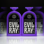
Evil Ray by Seachange
Until fairly recently, arguably sunscreen brands have had to do little in the way of brand design. Instead, they’ve been able to coast along relying on their credentials alone – and the fact that (in the UK at least) there hasn’t been a ton of competition. Things have been largely almost medicinal and rigidly adherent to category tropes: orange, yellow,...
Cocolab by Wedge
It’s pretty hard to get excited about dental floss. Oral care, for the most part, lives firmly in the realm of obligation rather than desire, a twice-daily chore that sits somewhere between setting your alarm and taking the bins out. It’s precisely this emotional dead zone that Cocolab (formerly Cocofloss) set out to disrupt when it was founded in California...
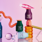
Butter Baby by Universal Favourite
It takes a skilled pair of hands/creative agency to make you fall in love with a fictional character (lore-laden backstory and all) who is literally a big blob of fat. But as has become increasingly apparent over the years, Universal Favourite (The Dinner Ladies, Monkey Baa Theatre Co., LBDO) is more than a skilled pair of hands – I honestly...
Current State by Werner Design Werks
Current State is a skincare line launched by sisters Emily and Lanie Parr a couple of years back, which aims to “disrupt the status quo”, according to Werner Design Werks which created its boldly multicoloured branding. There’s a lot to love about this packaging and brand design – not least, that expansive approach to colour. It seems that Werner Design...
Hank’s Bagelry by Studio Ongarato
Sometimes, a brand identity can be deeply strategic, have a rich heritage or an involving narrative. Other times, it can be simply eye catching and cool. Suites of custom designed icons, art directed photography, tone of voice, motion behaviours, programmatic graphic elements and bespoke in-house content generating tools…. not every brand needs these. They’re colours to paint with. I call...
Monica Rich Kosann by Here
There’s been a fair bit of chatter in recent times in the brand design world about the ‘new codes of luxury’ – how today’s hip young well-to-dos are eschewing the signifiers of yesteryear (ostentation, gold, bling, anything remotely showy) for a more understated aesthetic. Being fabulously rich today, then, is perhaps a little like the whole ‘no makeup’ thing: anyone...
12 by Base Design
If New York really is the city that never sleeps, that’s in no small part thanks to coffee – and now, increasingly, a newer entrant to the socially acceptable uppers scene, matcha. Capitalising on the growing interest in the sludgy green pick-me-up is 12, a new-ish matcha-centric café and retail store that opened last year in Manhattan’s NoHo area. Sited...
Sigma by Stockholm Design Lab
You could argue that there’s a fair few similarities in terms of Japan and Sweden’s approach to design, and the aesthetics of life more generally. Both are known often for a specific kind of minimalism – a tastefulness that eschews fluff, luxuriates in crisp whites and keeps its edges, everything in its right place, rules and order and form following...