Designed by Bunch
Baluna by Grupa by Bunch
Grupa is an award-winning design studio and manufacturer of handmade furniture and lighting products for home, office and hospitality spaces. Building on over a decade worth of experience Grupa branched out into own brand products in 2012. From drawing board to design and development, production, packaging and distribution, the company has developed a total design philosophy and a product range that...
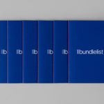
Bundlelist by Bunch
Bundlelist is an online platform that simplifies and draws together international mobile bundle costs, with a specific focus on mobile retail data, and facilitates comparisons between countries and mobile operators. Design studio Bunch worked to develop UX, UI and visual identity for the platform, which included logotype and a bundle of promotional notebooks....
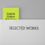
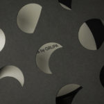
Galerija Kranjčar by Bunch
Galerija Kranjčar is an art gallery, located at the heart of Zagreb, opened in 2006 to showcase the work of Croatian contemporary artists and function as hub for a variety of cultural activities. The gallery is a long and unique space, one that balances the modern and historic. This can be seen in the meeting of smooth white walls, concrete floor...
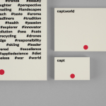
Capt by Bunch
Capt is a San Francisco-based start-up that connects creators wanting to monetize their videos with brands looking for new content and talent. The platform is made up of an app that allows creators to shoot, upload and license their videos, and a website that acts as a market place for buyers. This website also serves as a place to connect creatives with those...
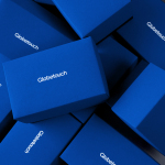
Globetouch by Bunch
Globetouch is a UK communications business and platform owned by operators and providing a wide range of mobile devices with access to a global and cloud-based ecosystem through an extensive network of offices and data centres. This extensive network and global reach is expressed throughout Globetouch’s brand identity, created by Bunch, using a modern pared-down colour palette inspired by migratory birds, a G that matches...
Johnny Roxburgh by Bunch
Johnny Roxburgh is an entertainer and party designer working with the rich and famous nationally and internationally. He has over thirty years of experience and has held a royal warrant for the last nine. In the words of The Scotsman, Johnny is capable of turning the whims and fancies of the world’s wealthiest one percent into glittering realities. These have included, but are certainly not limited...
Decontoured by Bunch
Decontoured is a Milan based, by appointment only, fashion label that provides a bespoke service for redesigning existing garments. Its philosophy is firmly rooted in an aesthetic sustainability and value that transcends seasonal fashion trends, and acknowledges a shift in consumer behaviour from the mass-market towards conceptual products and personalised practices. The label’s approach is one of collaboration, craft, innovation...
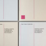
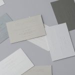
Rush Talent by Bunch
Design studio Bunch worked with Rush Talent, a London based public relations company, to develop a visual identity, this included monogram, logotype and stationery design. Rush Talent describes itself as at forefront of the factual and lifestyle television scene and represents emerging UK broadcasters working within the fields of fashion history, sports, science, architecture, food and art, and includes the likes of Amber...
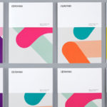
Cerovski by Bunch
Cerovski is a young Croatian print production studio that revels in the challenge of “nebulous finishing, microscopic editions, absurd materials and crazy deadlines”. Bunch worked with Cerovski to develop a new brand identity for the studio—which included a custom logotype and typeface, website, and a variety of printed collateral—that delivers a distinctive contrast of utility and creative flourish, technology and individualised service...
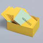
Sebazzo by Bunch
Sebazzo is the London based interactive studio of digital design duo Sebastien Hefel and Michael Azzopardi. The studio creates applications, websites and generative installations for a variety of brands and specialises in ‘innovative e-learning environments’. Design agency Bunch recently created a visual identity and stationery solution for Sebazzo that conveys digital design as a craft and the duality of the partnership...

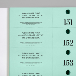
Willow Tree by Bunch
Willow Tree, one of London’s leading business consultancies, worked with graphic design studio Bunch to develop a new but traditional-looking visual identity with an attention to detail. Based around a WT monogram, created by typographer Spencer Charles, utilised as a mix of embosses, carved in seals and simulated watermark, and using purple cloth, black leather, cream paper and handmade coffee pottery, Bunch’s solution embraces a...
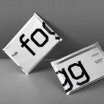
Fogg by Bunch & Kurppa Hosk
By purchasing overcapacity from international telecom networks, Fogg Mobile provides a fixed cost mobile data traffic service for people who want to avoid unexpected roaming bills when travelling abroad. Through the animate and evolving qualities of computer generated imagery and a combination of unbleached paper, stitching, flat coated colour and silver polypropylene, Fogg’s visual identity, created by Kurppa Hosk and developed by Bunch, delivers...