BP&O Collections — Business Cards No.17
Opinion by Richard Baird Posted 25 May 2020

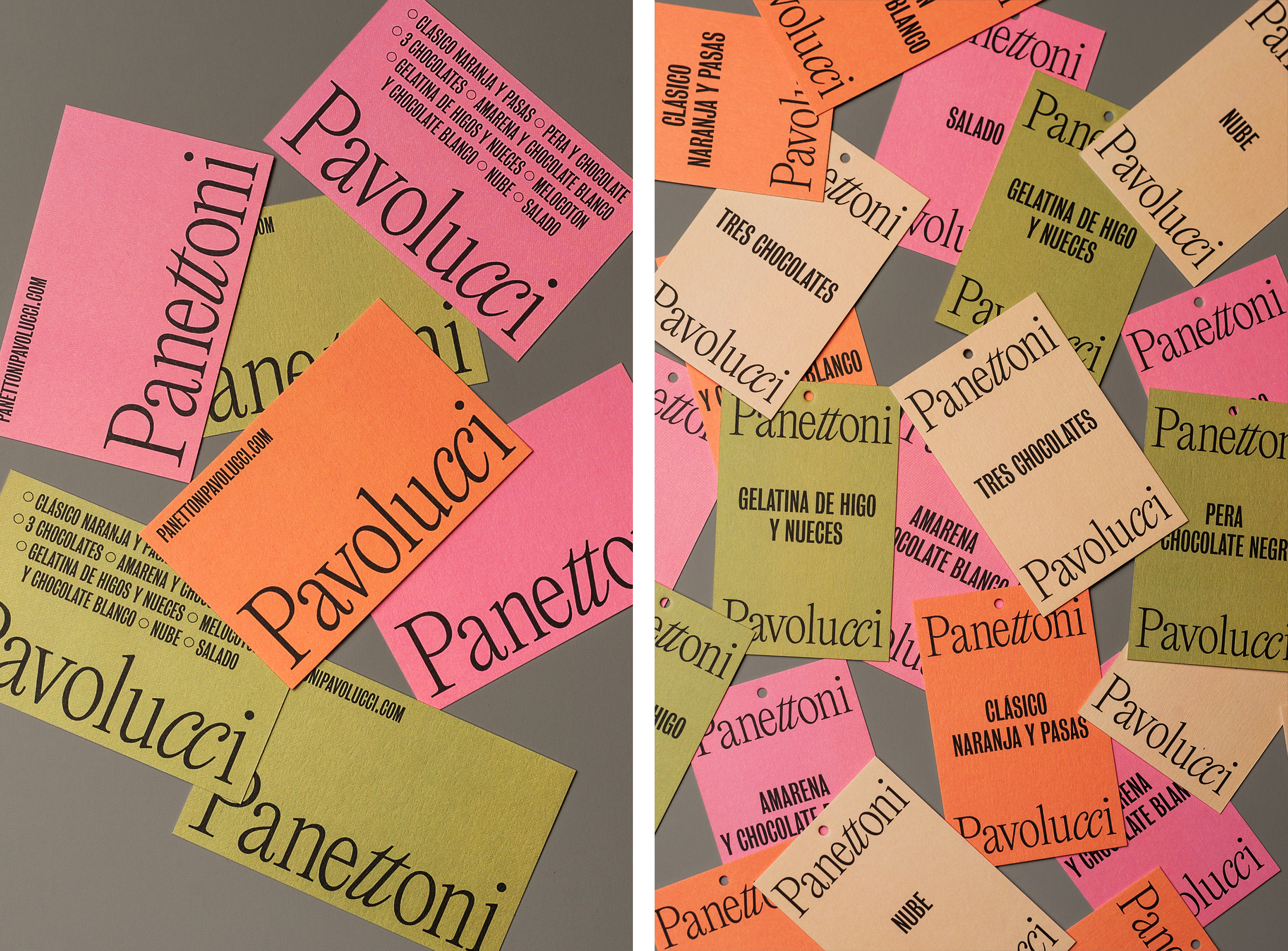
A collection of distinctive business cards designed as part of a broader brand identity programme, reviewed and published on BP&O. Between them, these bring to light how colour, type, form, layout and contrast, as well as material choice and print finish, contribute to a distinctive and expressive visual identity.
This set includes fluorescent ink, dyed papers and folds, illustration and striking pattern. Featured studios include Order, Bond and Spin. Click through to get a sense of how these fit within a broader brand identity program and the communicative intentions that underpin aesthetic choices.
This post was published as a quick way to browse through BP&O’s content and gain access to older but equally interesting projects through different themes, and expands upon previous posts under the category BP&O Collections. If you liked this check out – Business Cards No.16, Business Cards No.15, & Business Cards No.14, or subscribe to this series here.

Northstar Film Alliance by Bond


PLATF9RM by Studio Makgill

Freadman White by Studio Hi Ho

andSons Chocolatiers by Base Design

Salbini by Studio Brave

The Golden Hour by Triboro

The Architect’s Bookshop by Garbett

Varnom Ross by Bibliothèque

Hackney Forest School by Spy

Brilliant by The Studio

Teatulia by Here Design

Air Studios by Spin