Green messaging has become standard. Proving it without drifting into low‑budget tree‑hugger territory is very much a balancing act.
Building a sustainable brand is not only about materials, carbon footprints or ethics. The real task is making honesty feel like value, especially when the product is as ordinary and unglamorous as loo roll.
In theory, sustainable branding sounds straightforward. Use better materials, be transparent, keep things grounded. In reality, the moment a brand steps away from familiar category cues, it has to earn attention in a more exposed way.
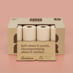
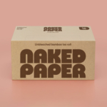
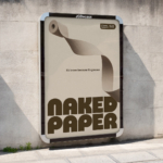
This is why Naked Paper stands out. They built their identity around the one thing the category hides. The natural colour of the product. The thing every competitor bleaches out of existence. Instead of treating brown as compromise, they turned it into the brand’s strongest asset.
Most loo roll brands still cling to the idea that white signals softness, cleanliness and quality. Yet white is the most artificial part of the whole experience. It comes from processing, chemicals and habit rather than logic or need.
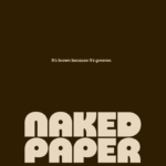
Naked Paper breaks that illusion. Brown because it’s unprocessed, recycled or made from bamboo. Brown because it reflects the material exactly as it is, not what the market has trained people to expect. The honesty lands immediately because nothing is disguised.
From a design point of view, less does more. Once the pressure to match category cues drops away, the material becomes the hero.
“It is brown because it is greener” works for that reason. It is simple, direct and grounded in the product itself.
But this only holds if everything stays aligned. Sustainable brands often drift when the identity tries to work harder than the product. Challenging a category only works if every element reinforces the same idea. When the material carries the story, the graphics cannot fight it. When the product is genuinely unprocessed, the tone has to stay just as clear.
Naked Paper shows what happens when a brand commits to one idea and lets the material lead. The identity holds because there is no attempt to pull the product back toward predictable category codes. The material sets the tone and everything else follows.
The strength comes from resisting the urge to “correct” the brown. Keeping it honest gives it presence. That clarity is what makes the pack stand out on a shelf full of artificial purity.
Design: Otherway