Beams by Only Studio
Opinion by Thomas Barnett Posted 16 November 2023

The Beams is ‘an expansive new venue and event space on the Royal Docks in the heart of East London’ (that’s as long as you prefer your cartography loosely impressionist). Manchester-based Only Studio was tasked with branding the former Tate & Lyle sugar factory. The award-winning agency has previous form in the field of London industrial-eyesores-turned-cultural-juggernauts: it was also responsible for the spectacular rebrand of the (now tragically demolished) Printworks. The sublime rolling logo and brand vocabulary was memorable, laconic, cool and just a tiny bit menacing – everything you want from a nightclub. Can Only score another home-run?

To describe this work as ‘type-led’ would be an understatement. In reality, there is little more to this brand than the cool Swiss serenity of Neue Haas Grotesk. That, and more restraint than a rollercoaster seatbelt. And honestly, little else is needed.
Neue Haas Grotesk is Commercial Type’s wonderful reincarnation of Max Miedinger’s Helvetica prototype. It was completed for Richard Turley’s 2010 redesign of Bloomberg Businessweek as a restoration project, bringing the letterforms back to life with as much fidelity to Miedinger’s original shapes and spacing as possible. Miedinger’s version included a number of interesting alternates, including a striking straight-legged ‘R’, originally available by special order only, but now easy to access in digital form (although Only have opted not to use this distinctive character, sticking closer to the classic Helvetica styling that Neue Haas Grotesk grew into).


No flourishes are expended on the logo. It is only by case – being set in all-caps (with fractionally tighter tracking) – that it is distinguished from otherwise generally sentence-case typography. This deep understatement suavely allows the focus to stay on the DJ, artist, film-maker (or corporate event) that is occupying the Beams.
This seemingly frictionless logo does create one small snag though. Anyone who’s ever had the misfortune of speaking to a man at a houseparty will inevitably have experienced a weirdly antagonistic conversation about music, in which cultural cachet is leveraged by correcting you on whether or not a band/artist requires a determinative proper article – ‘umm actually it’s just “Pixies”, not “the Pixies”’. This most cherished strategy of boring blokes in band-tees has been cannily (or unintentionally) deployed by (the?) Beams, generating pedantic confusion but also, crucially, hauteur. While the venue is ‘The Beams’ as both a physical (see Google Maps) and digital destination (www.thebeamslondon.com), that prefixing article is eschewed in the logo, guaranteeing that some will deploy it and some will not, affording both sides the opportunity to condescendingly correct the other, and consequently fostering a feeling of cool affinity from the corrector and jilted aspirational longing from the correctee. Well played the Beams.
![]()


Whatever we call it, according to Only, the name ‘speaks to the factory-style light wells in the roof that flood the main space with natural light, and signifies its role in supporting and showcasing new talent, activations, productions and experiences’. This touches on one of the key principles of the identity: to reflect the particular architectural tone of this cavernous, glaring, post-industrial space. Only goes on to explain that ‘A dynamic typographic treatment is used to mirror the repetition seen throughout the building’s architecture and to establish a connection with the use of light in many of the venue’s cultural offerings.’
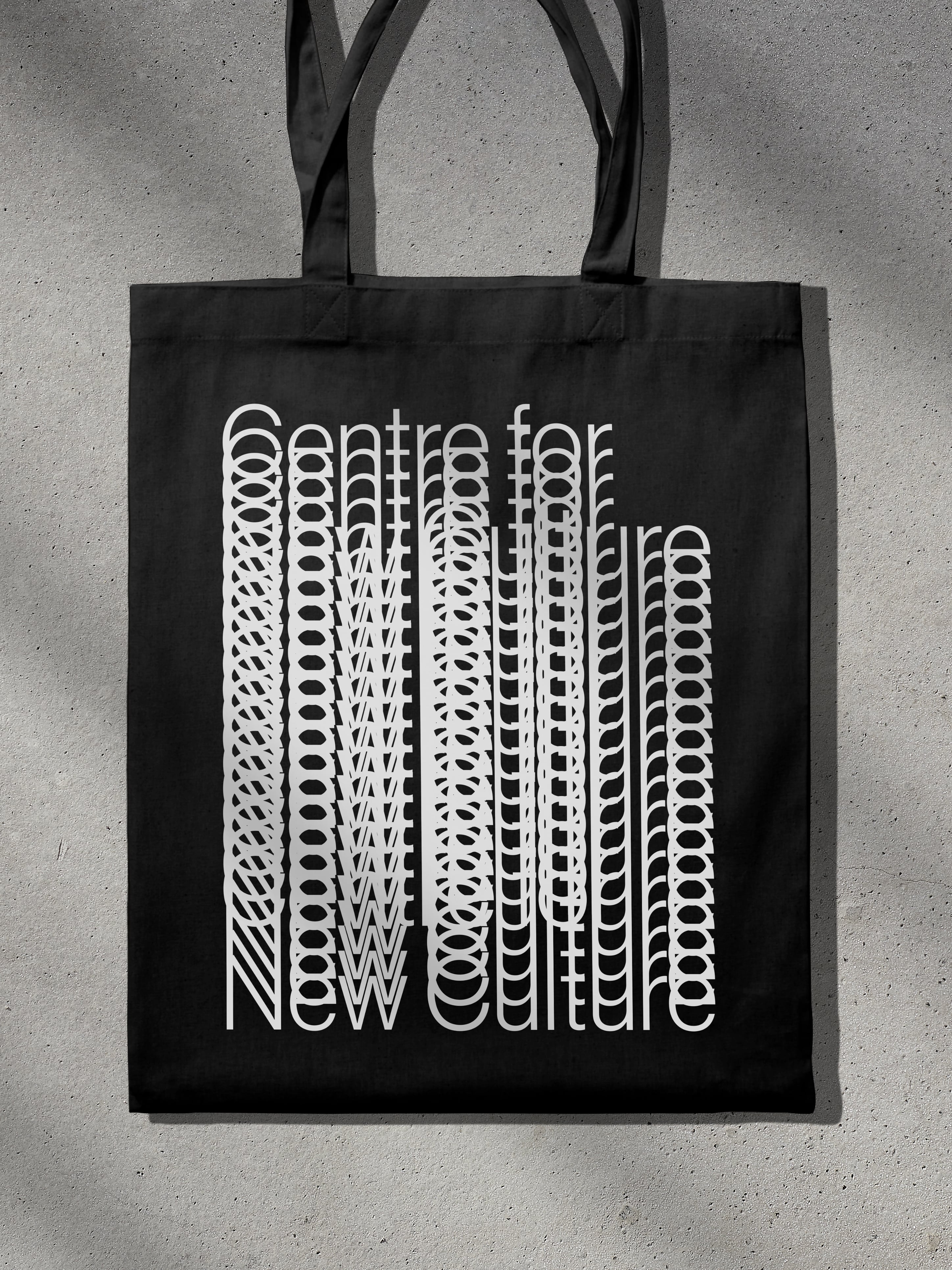
This treatment takes the form of repetitions along a linear axis (much like those achieved with the ‘blend’ tool in Adobe Illustrator). Some are more successful (and legible) than others. Top of the pile are the headings on the homepage, which collapse into themselves as you scroll – very cool. In fact, most of the typography works well when animated elements are introduced. The motion version of the logo is another satisfying result.

When the typographic treatments are presented as static designs, however, they are more controversial, particularly when repetition occurs along a horizontal (rather than vertical or diagonal) axis. This leads to maximum overlap of letters and minimal legibility. This issue is further exacerbated in a billboard example, in which the logo is given this treatment, by the fact of the letters being set in all-caps, with no x-height differentials offering even a vague clue as to what letters are contained within the pseudo-Carson-esque tangle. If this billboard was your first exposure to BEAMS (as a billboard often is), it would be entirely reasonable to misconstrue it as a particularly hip Northern bakery, bringing BARMS to the attention of Londonders, or that perhaps a highly-organised cabal of BEARS had devised and printed their own promotional campaign, hampered only by clumsy paws on tiny keyboards. This is, of course, facetious and misses the point that you are perhaps not supposed to be able to read the lettering, but like the ambiguity about whether it is Beams or the Beams, there is a whiff of superciliousness about it.

To streamline the creation of these type treatments, Only has thoughtfully developed a simple but effective design generating tool, offering a limited set of simple parameters for size and position, as well as number of repetitions and canvas ratio. The tool is a limited example of its kind (see DIA’s work on smlXL for more complexity), but it effectively covers pretty much all the possibilities for brand artwork. The simplicity serves as a reminder that this project excels in proving that much can be done with little – it is a poetic exercise in minimalism.


Photography from Marcus Ginns and Henry Woide offers crucial balance to the typography. Grain, light-flares and unusual compositions provide welcome relief from the strict grids and clinical monochrome that dominates elsewhere. The colour photography is particularly successful, bringing some life and levity, and reflecting the vibrant cultural scene that Beams hopes to become home to. In terms of the internal logic (in which the brand is supposed to be a reflection of the architectural space), the colour photography also works well, picking up on some of the incongruous coloured elements in the building – red heating ducts that run around the tops of the walls, the warmth of the unpainted exterior brick. This judicious application feels true to both the physical reality and cultural ambition of the space. When scrolling through Beam’s meticulously neat Instagram feed, it is reassuring to see that the marketing team rapidly switched from predominantly black-and-white squares to vividly coloured images that nonetheless preserve the austere art-direction.

To summarise, Only’s identity for BEAMS is a masterful achievement. It performs the branding equivalent of stealing a red-carpet with nothing but a little black (or in this case white) dress. It is extremely difficult to look so good wearing so little.