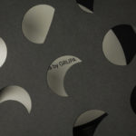
Die Cut Design Detail
Joyful Outdoors by Alphabetical
Over the years, London-based Alphabetical has honed both a distinctive style and a distinctive client list: often, its most celebrated projects are those for brands or organisations that are both a unique place, and more specifically a site for a community that’s underserved or underrepresented. In short, Alphabetical has honed its knack for uniting a people-centric, frequently cocreation based approach...
PAC NYC by Porto Rocha
There have been some brilliant logo designs inspired by the very buildings they represent. The Centre Pompidou, for instance, bears a powerfully stark logo that’s been largely unchanged since it was first created in the 1970s: six black stripes crossed by two zigzags representing the site’s ‘caterpillar’ escalator, one of the most famous parts of Renzo Piano and Richard Rogers’...
Stereoscope by Olssøn Barbieri
Oslo-based multi-disciplinary design studio Olssøn Barbieri has created the brand identity for Los Angeles-based speciality coffee roastery Stereoscope, working across its packaging design and printed materials with a typography-led approach that celebrates tactility. According to Olssøn Barbieri, Stereoscope is underpinned by a philosophy that sees coffee as a living organism rather than a commodity, and which takes its responsibility to...

The Wool Pot by Seachange Studio
More plants, less plastic. A noble mission. Over the last decade, revelation has followed revelation with regards to the environmental impact of what seemed like the most innocuous of objects. Now it’s the turn of the humble flower pot. Yep, that. Stacked and sitting empty in the shed, or at the bottom of the garden. It turns out that these...
OneFourFive Clarendon by Studio Brave
OneFourFive Clarendon is a modern workspace, developed by Salta, designed by Architectus and created for future-focused businesses looking to situate themselves in Southern Melbourne. The development aims to attract like-minded progressive people with a conscious focus on connectivity and local activity. With this in mind, Melbourne-based Studio Brave developed the narrative ‘A Life Unlimited’ as a way to express how the...
Napier Street by Studio Hi Ho
231 Napier Street is an eleven apartment building, now sold out, created by property developer Milieu, set with the culturally rich part of Fitzroy, Melbourne. It is their first collaboration with architect Edition Office—an innovative practice with a strong conceptual focus—and part of the developer’s ongoing enquiry into and interrogation of the dialogue between architecture and place. This interrogation forms...
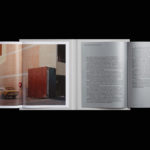
Schubertíada Vilabertran by Mucho
Schubertíada is an annual festival run by Associació Franz Schubert that celebrates the works of the 19th-century Austrian Romantic composer Franz Schubert. This takes place in the Spanish municipality of Vilabertran in July. The festival includes a programme of chamber concerts, lied recitals, instrumental solos and lectures. Schubert is known, not just for his compositions, but for his contribution to Lieder; German poetry...
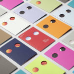
Baluna by Grupa by Bunch
Grupa is an award-winning design studio and manufacturer of handmade furniture and lighting products for home, office and hospitality spaces. Building on over a decade worth of experience Grupa branched out into own brand products in 2012. From drawing board to design and development, production, packaging and distribution, the company has developed a total design philosophy and a product range that...
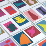
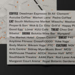
Cult 20 Years, Event & Exhibition by Toko
In 2017 Australian furniture retailer Cult celebrated its 20th anniversary. They marked this with an event and exhibition and worked with design studio Toko to develop a graphic identity to unify these and bring to light their extensive catalogue. Through a mix of bright illustrative silhouettes across invitations, packaging, postcards, flags and banners, the art direction of some Cult’s ranges, and...

Chus x Chus by Pentagram
Spanish jewellery designer Chus Burés is recognised for the avant garde quality of his work and his ongoing collaborations with a wide variety artists and designers. These have included American-French artist Louise Bourgeois, American-Cuban painter Carmen Herrera and French fashion designer Agnès B. Working with those in the fields of contemporary art, fashion, cinema and music, Chus Burés has developed...
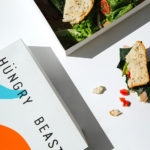
Hüngry Beast by Savvy
Hüngry Beast is a cafe and juice bar located in Mexico City’s Roma Norte neighbourhood, a place of recent cultural and gastronomic development. It is a modern and casual experience with a focus on simple, high-quality cold-pressed and gluten-free products creatively prepared from healthy organic ingredients. The urban, natural and creative positioning of the cafe is expressed materially throughout an...
Jackalope Hotels by Fabio Ongarato Design
Jackalope Hotels is a luxury hospitality experience developed by Melbourne-based Louis Li, a hotelier described as having a penchant for the avant-garde. The first Jackalope Hotel is situated in the heart of the Mornington Peninsula, Victoria, Australia. It is unique in its location, surrounded by the hotel’s vineyard, in its architecture and interior by Carr Design, and in its visual...