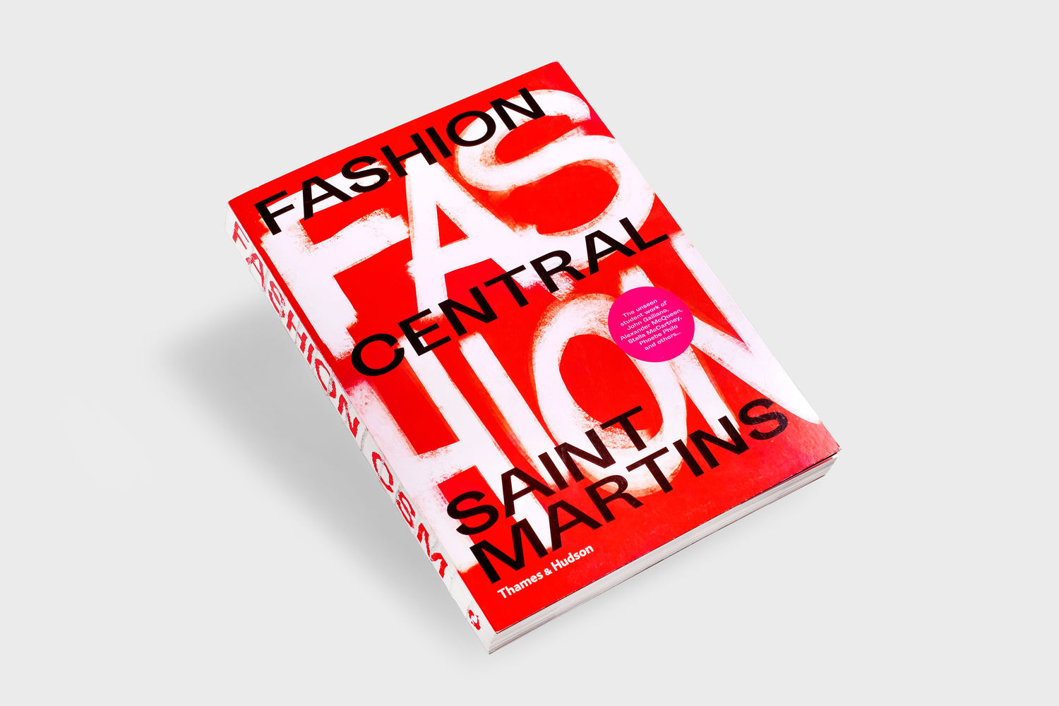
Fashion Central Saint Martins by Praline
Opinion by Richard Baird Posted 3 October 2019
Fashion Central Saint Martins documents and celebrates what has become one of the most influential fashion courses in the world. It is a collaboration between publisher Thames & Hudson and Central Saint Martins, and co-authored by Programme Director of Fashion Hywel Davies and Cally Blackman, lecturer in Fashion History and Theory.
The Central Saint Martins Fashion Course has a legacy of rebelliousness, pushing back against establish design conventions and subverting expectations. The course encourages self-expression, boldness and creative curiosity. Design studio Praline, who were commissioned to design the book, sought to embody this spirit within the space of the page and throughout the materiality of the bound book.

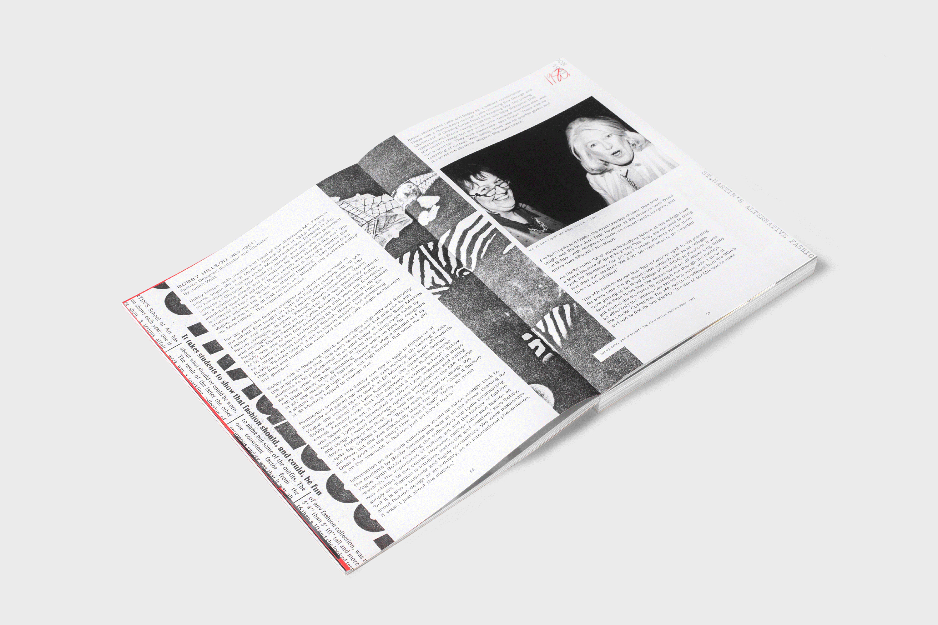
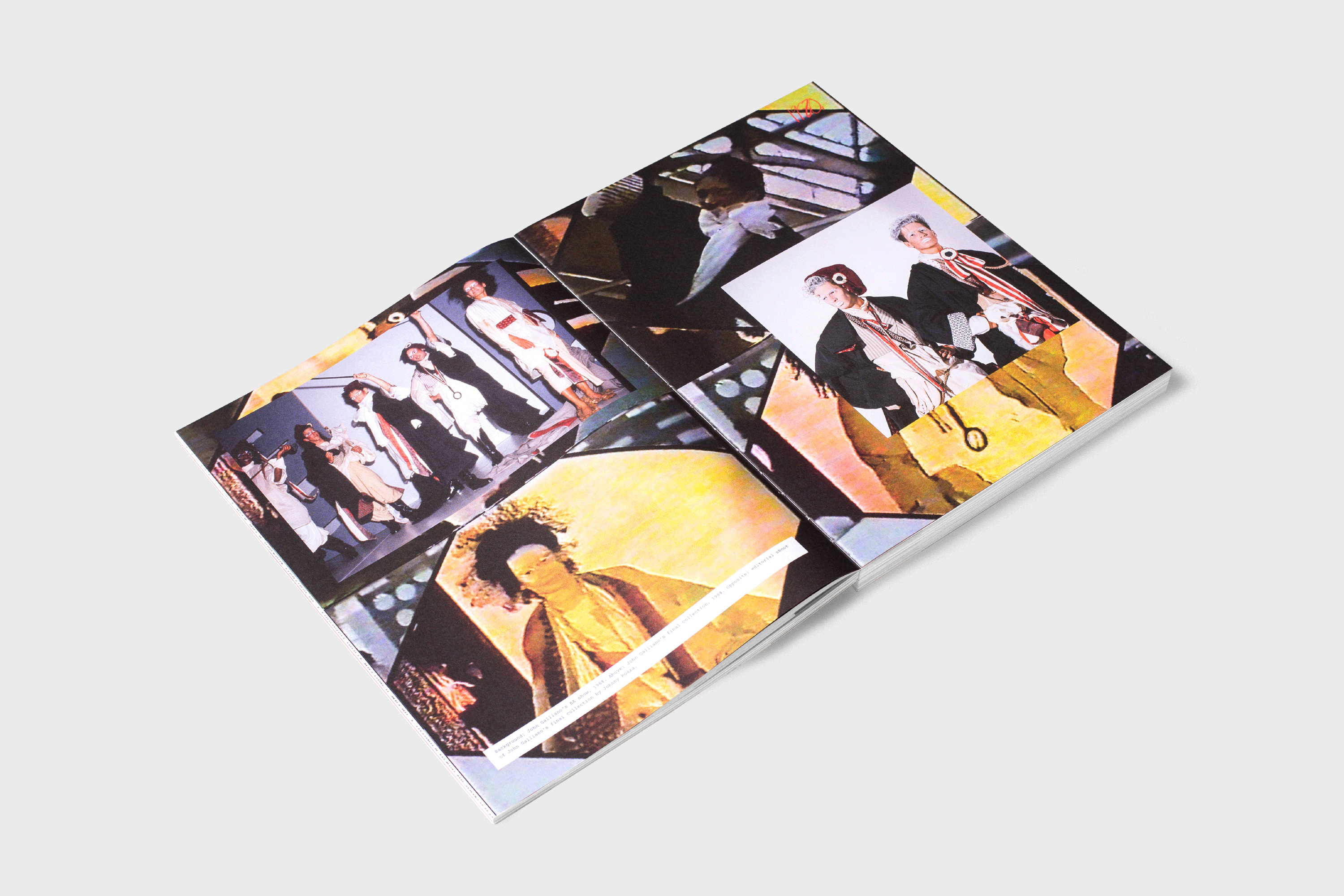
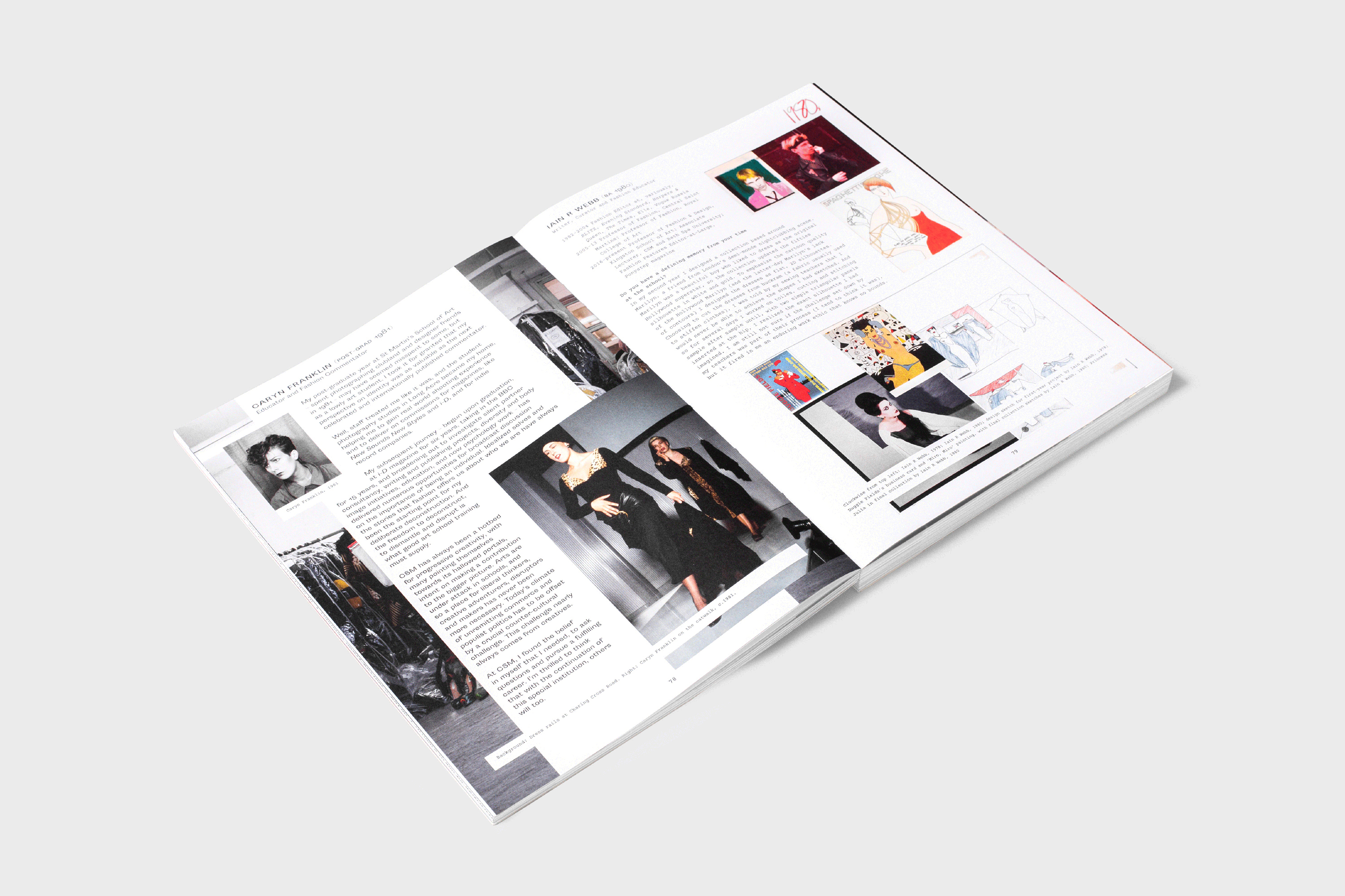
The book is comprised of never-before-seen work, alumni profiles and exclusive interviews with former students, those who have gone on to establish themselves in the fashion industry. The book weaves together a tapestry of early sketches, first student collections and fashion shoots from designers such as John Galliano, Stella McCartney and Alexander McQueen. It features essays by guest-writers and contributions from journalists Hamish Bowles and stylist Katie Grand. And collates some of the memories, characters, inspirational teachers, and words of wisdom that emerged from the course. These are structured chronologically, from 1921 till today, with the first chapter dedicated to the early years (1930s to 1960s) and followed by chapters split by subsequent decades.


The book that intends to peak the interest of casual and avid fans of fashion and those entering formal fashion education. In its edited nature, in the positions held by its editors, the book is likely to be both histrionic and mythological. Praline recognise this, and apply a visual language of rebellion to support this editorial remit. This is characterised by the imposition of large cursive handwritten gestures across imagery and the roller of the cover and the striking use of a provocative bright red. There is an energy and activity to much of the book, some of it employs immediate and universal graphic gestures, however, these are supported by some nice subtle details.

These subtle details include the flat bind which gives spreads the quality of a large single page without a crease, evocative of the large landscape sheets of paper used for designing. The use of layering, often giving the page the qualities of a table of photography, shots from shoots to be selected and discarded. This is particularly nice in that this gesture almost has a one step back quality. We see, or invited to feel like the images are those yet to be edited, there is a language of the candid employed here. The naked spine serves to express this outwardly, as well as functioning to differentiate it from those fashion publications that are polished, presenting the exterior rather than the interior world of fashion.

Photocopied pages are quick to communicate legacy, breaking up the content and contributing to an overall sense of the unedited and the quickly collated sensibility throughout. The black and white nature of these, and the bright red chapter openers develop a rhythm and range to the chronology of the book, and help to give structure to a bustling book that channels some of the qualities of an independent magazine from the 70s.
Further highlights include the cropping or saturation of imagery as though they were pulled from secondary sources such as magazines or a VHS screenshot of runway shows, as well as the approach to typesetting, often moving around photography, elevating the importance of imagery to the story and type being supportive. Type choice supports this in its typewriter letterforms, there is a documentary and journal-like utility to this, rather than the formalised. It is keen to avoid an aestheticised presentation of fashion you often see. It is provocative and different, aligned with a story and attitude, rather than simply trying to stand out for the sake of it. Further, imagery that feels behind the scenes, immediate, playful, or sequential stills pulled from film gives it movement and life, that the course has fostered an individuality and camaraderie.

Just as the book itself tries to narrativise a significant legacy, one with diverse characters, over periods that saw changing attitudes, the designers employ and multiplicity of visual and tactile techniques. There is a graphic abundance here. Much of this will be familiar to graphic designers, some overt and blunt, others, nuanced. Praline describe some of their choices as bordering on irreverence, having moments of inhibition and urgency so, as much as this may be seen to mythologise, the book feels genuine in its intention to capture a spirit of period and place, of diverse peoples and projects, to avoid the coffee table and be a rich reference point in which to inspire.