Flowers
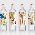
Nongfu Spring Mineral Water by Horse
Nongfu Spring is a bottled mineral water brand and a leading Chinese beverage business. Nongfu worked with British design studio Horse to develop a new package design treatment that, using labels illustrated by designer Brett Ryder and a distinctive structural design with a slim profile and proprietary leak-free sports cap, would engage the youth market....
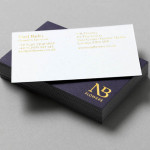
NB Flowers by Karoshi
NB Flowers is a florist – founded by Neil Birks and located at London’s New Covent Garden Market – that specialises in corporate and private events, delivering value through a combination of ‘beautiful flowers, creativity, and a personable service’. Multi-disciplinary design agency Karoshi were commissioned to ‘rebrand and reposition NB Flowers as one of London’s leading luxury event florists and capture the essence of the...