Art Gallery Logos and Brand Identities
Koto breathes new life into Floridian arts institution The Norton
The Norton Museum of Art began life in 1941 in West Palm Beach, Florida, and in the near-century since, its whole raison d’être has been based around its role as a place where “art and life meet as a part of everyday art”. As such, it acts as more than a look-don’t-touch-style gallery space: the garden, gallery and restaurant are...
Off-kilter and elevated
St Paul’s Cathedral is undoubtedly one of the most iconic, recognisable landmarks of London’s skyline: its vast dome, all beautiful copper-tarnished turquoise, resplendent with dazzlingly golden pineapples (one of its architect Sir Christopher Wren’s favourite accoutrements, and back in the 17th century a distinct status symbol representing all that was bountiful and exotic). Until 1963, St Paul’s was the tallest...
Kanal by Base Design
Kanal is a museum-to-be with an admirable yet bold raison d’être that defies much of what we think we know about the nature of highbrow cultural sites: not a “finished institution, but a cultural project in motion,” as its general director Yves Goldstein puts it. Based in Brussels, Kanal will – somewhat surprisingly – become the city’s only museum of...
Kunsthalle Basel by Porto Rocha
Basel is a fascinating place – beautiful but unassuming, relatively small but the undisputed capital of the contemporary art world. Not only is it the host of – as you’d guess from the name – Art Basel, the Art Fair that arguably forms the pinnacle of the global art market calendar, but it also has one of the highest densities...
The Huntington by Base Design
There’s a particular kind of challenge that crops up again and again in cultural branding – not obscurity exactly, but partial recognition. The sort where an institution is famous for one thing, quietly exceptional at several others, and yet rarely understood as a coherent whole. The Huntington, a century-old cultural and research institution in Southern California, sits squarely in that...
Philadelphia Art Museum by Gretel
Creating museum and gallery identities must be both a dream brief and an intimidating prospect for brand designers; a poisoned chalice of sorts. We hear the same challenges time and again when agencies discuss such projects: creating a brand that’s both strong and ownable but which lets the artefacts/art take centre stage; an identity that takes an institution into the...
National Portrait Gallery by Edit Brand Studio
In June 2023, a giant of British cultural life awoke from a three year slumber. The return of the National Portrait Gallery evokes a joy that is made all the keener when one recalls the troubled time in which it closed its doors: March 2020, as the COVID-19 pandemic took hold and public life evaporated in the announcement of that...
The Art Gallery of New South Wales by Mucho
The Art Gallery of New South Wales, founded in 1872 as the New South Wales Academy of Art, suffered from a fragmented brand architecture. Addressing this through a rationalised and simplified system, and reinforcing the master brand across all Gallery collateral became a central part of developing of a new brand identity which would support a repositioning strategy that moved...
Metamorphoses by A Practice For Everyday Life
Metamorphoses is a contemporary art gallery that curates unique pieces by makers who turn one thing into another. It takes a special interest in works that are inspired by the past while displaying keen attention to present issues. These pieces, selected by the gallery, are often drawn from a body of work by artists who reflect on aspects of cultural...
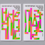
Buk Seoul Museum of Art 2018 Season by Studio fnt
Buk Seoul Museum of Art is an art museum and park where art, community and nature coalesce. It promotes cultural activity and interaction and brought cultural spaces and facilities to the North-eastern part of Seoul where they were previously lacking. The museum is marked not only by its distinctive forms, designed by Samoo Architects & Engineers and completed in 2013,...
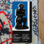
Sumer And The Modern Paradigm by Clase bcn
Sumer And The Modern Paradigm is an exhibition at Barcelona’s contemporary art gallery Fundació Joan Miró, and runs from 28th October 2017 to 21st January 2018. It intends explore and attempt to explain the influence of Mesopotamian art on modern artists, with a particular focus on the interwar period. The exhibition analyses work produced between the twenties and forties, takes a look...
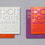
Highlights by Studio fnt
Highlights is an exhibition of works from French contemporary art museum The Collection of the Fondation Cartier pour l’art contemporain at the Seoul Museum of Art (SeMA). The exhibition runs from May 30th to August 15, 2017, features work by artists such as Ron Mueck, David Lynch and Sarah Sze, and also includes commissioned pieces and major artworks by Korean artists. Highlights is curated...