Jewellery Logos
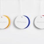
Monica Rich Kosann by Here
There’s been a fair bit of chatter in recent times in the brand design world about the ‘new codes of luxury’ – how today’s hip young well-to-dos are eschewing the signifiers of yesteryear (ostentation, gold, bling, anything remotely showy) for a more understated aesthetic. Being fabulously rich today, then, is perhaps a little like the whole ‘no makeup’ thing: anyone...
Osofor by Paul Belford Ltd.
Osofor will be a digital-first and lab-grown diamond jewellery business able to create stones of any shape and cut. It will offer a modern and sustainable luxury brand to those who desire the material qualities of diamonds without the environmental and sociological impact. Osofor intends to distinguish itself further by fusing enduring aesthetic desirability and artisanal practice with experimental materials, unexpected production processes,...

Maison De Greef 1848 by Base Design
Maison De Greef 1848 is a high-end luxury jewellery brand, expert watchmaker and retailer that opened its first shop in 1848 at 24 Rue au Beurr, Brussels. Shortly after De Greef became the official clockmaker for the Belgian National Railway Company and then the supplier of pocket watches for the Belgian Navy. The brand has built an enduring legacy and weathered many...

Chus x Chus by Pentagram
Spanish jewellery designer Chus Burés is recognised for the avant garde quality of his work and his ongoing collaborations with a wide variety artists and designers. These have included American-French artist Louise Bourgeois, American-Cuban painter Carmen Herrera and French fashion designer Agnès B. Working with those in the fields of contemporary art, fashion, cinema and music, Chus Burés has developed...
January Moon by Perky Bros
January Moon is a range of contemporary teething jewellery from American artist and designer Jenny Luckett, created in response to the birth of her son and in the discovery she could no longer wear her favourite pieces. The range intends to satisfy the stylistic sensitivities of modern mothers while also aiding their child’s development. The range is characterised by a variety...
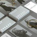
Tilly Sveaas Jewellery by Bond
Tilly Sveaas is a London-based jewellery designer, and the designer behind Silver Service Jewellery. This year sees the launch of her first collection under her own name. This features a brand identity created by the London office of international design studio Bond, and included art direction, postcards, business cards and packaging. Through typographic form, colour, material, print finish and image, Bond’s...

Iona Brown by Sam Flaherty
Iona Brown is a London based contemporary jewellery designer who favours classic simplicity, understated detail, precise finishes and minimalist lines, shapes and materials. Graphic designer and art director Sam Flaherty recently worked with Iona to develop a new visual identity for her expanding collection. Built around a customised logotype and a simple print and packaging treatment that uses few but good quality and contrasting...
Mark Milton by ico Design
London-based design studio ico Design have recently completed their brand identity work for Mark Milton, a jeweller with a family heritage within the industry that dates back to 1947, and who carefully selects and retails a range of necklaces, earrings, bracelets and rings for women. Bound by the theme of curation, ico Design’s solution provides the Mark Milton brand with a high quality communicative breadth...
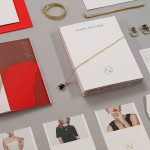
Sancy & Regent by OK-RM
Sancy & Regent is a UK-based online boutique retailer of limited edition jewellery created by young international designers. Their visual identity, developed by independent design studio OK-RM, combines classic type, proprietary quirk and subtle embellishment with tactile material choices and a hidden high quality print finish, to convey small-scale craft with consistent, curated quality....