Designed in London
Storrd by Among Equals
London is awash with convenience stores – from the acrid yellow signage of Nisa to the misleadingly named ubiquity of Costcutter to the countless independents named things like Ben’s, despite the fact they have nothing to do with anybody called Ben. Such shops – reliably there at most times of day, reliably overpriced (hence the convenience I suppose, like an...
So Energy by Studio Blackburn
I’ve said it before and I’ll say it again: it’s all well and good making some striking, retina-toastingly fluoro, brave as hell design work for, say, a kombucha startup or CBD lube or a record sleeve or an art book. These things are by dint of their very existence, context, and audience, already sort of cool. But the real creative...
Yum Bun by How&How
Arguably London’s street food scene has become less a ‘scene’, more a network of long queues sprawling their way across the capital faster than you can say ‘SEVEN pounds! For some strawberries!’ From Borough to Barbican’s Whitecross Street, Spitalfields to Southbank, Camden to Covent Garden; the menus are global, the prices hefty, the hype palpable, and the branding overwhelmingly forgettable....
Dark Arts Coffee by NOT Wieden+Kennedy
If a brand that fuses memes, hot takes, occultism, and coffee is going to succeed anywhere, it’s probably in east London. Dark Arts Coffee started out in 2014 in a Homerton railway arch, and managed to corner that distinct subgenre of goth/metal/biker-ish aesthetics which opts for craft ale over snakebite; Hackney over Camden; self-care over self-destruction. Where the old guard,...

Tameko by DutchScot
Founded by Dominika Leveau and Chim Sonne-Schmidt in 2021, textile brand Tameko feels thoroughly ‘Scandi’ in aesthetics and ethos – it’s all clean lines, a singularly restrained stance on beauty. It’s form following function. Tameko embodies that very contemporary take on the luxury sensibility that never shouts about its status. It doesn’t need to: luxe quietly but confidently oozes from...

Hello Klean by Two Times Elliott
Beauty is, of course, in the eye of the beholder, but there’s no denying that objectively, its branding and identity design has undergone some huge changes over the past decade or so. Gone are the days of faux-luxurious designs that were all about swathes of abstract silk; women coiffured to within an inch of their life; a microscopic lens on...
Compound by DesignStudio
What does ‘healthcare’ look like today, especially when we’re increasingly talking about preventative treatment? For Parsley Health and GlycanAge, which promote functional medicine, it’s serene – all blush pink, forest green and rounded corners; for Modern Age, which focuses on longevity, it’s more clinical, with high-resolution botanical imagery and classical icons; Ezra, which offers full-body MRIs as cancer prevention, goes...
Joyful Outdoors by Alphabetical
Over the years, London-based Alphabetical has honed both a distinctive style and a distinctive client list: often, its most celebrated projects are those for brands or organisations that are both a unique place, and more specifically a site for a community that’s underserved or underrepresented. In short, Alphabetical has honed its knack for uniting a people-centric, frequently cocreation based approach...
Isle of Wight Tomatoes by B&B Studio
Having grown up near Portsmouth, the Isle of Wight carries a certain resonance, though perhaps unfairly. Aged around 14, when getting served in off licences/particularly lax pubs wasn’t always a given, we’d sometimes pass the time watching the IoW ferry. It felt rather bleak, and somehow a bit futile, just bobbing back and forth between two destinations (Southampton and Cowes)...
Chyna Club by Bibliothèque
Over the past few decades, high-street menu-scribbler Wagamama has become a rare beacon of actually-very-nice-food among a sea of uninspiring spicy chicken, Giraffes, and Five Guys (arguably, simply too many guys). It turns out Wagamama has some pretty big-name siblings: Mayfair’s Michelin starred, celebrity-beloved Hakkasan; Thai stalwart Busaba; Cantonese eaterie Yauatcha; and Turkish restaurant chain Yamabahce all sit within the...
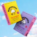
Superkeen by B&B Studio
There has never been more awareness of allergens and inflammatory ingredients, with lupins and sulphites now on the mainstream radar alongside common culprits like gluten and dairy. At the same time, nostalgia and anemoia (‘a feeling of yearning for a past that you never experienced’) have become driving forces shaping contemporary tastes. Direct-to-consumer cereals neatly bridge a gap in this...
Sendwave by DesignStudio
The concepts of ‘money transfer’ and ‘community’ don’t immediately seem to go hand in hand: the former feels cold, slightly dry, potentially confusing and rather literally transactional; the latter is all cuddly and feelings and people-y. But uniting these two seemingly disparate worlds is exactly what DesignStudio did recently in its rebranding of Sendwave, a digital platform offering money transfers...