Luxury Logos and Packaging Design
Feel the heat
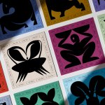
Most branding has to give some suggestion of what said brand is, or does, or stands for – it’s usually not ideal if they bear little to no resemblance or representation of their category, audience or ideals. The exceptions are usually things like record covers, or other inherently creative entities like musical instruments, editorial projects; occasionally booze brands, like the...
Society De La Rassi by Blurr Bureau
Ideas around the ‘new codes of luxury’ have come up a lot lately; an updated, contemporary take on what makes something look special, valuable, covetable, and ultimately, expensive. The long and short of it is that it’s out with the old – lavish foils, gold everywhere, bling and ornamentation and ostentation – and in with a quieter, more subtle aesthetic...
Monica Rich Kosann by Here
There’s been a fair bit of chatter in recent times in the brand design world about the ‘new codes of luxury’ – how today’s hip young well-to-dos are eschewing the signifiers of yesteryear (ostentation, gold, bling, anything remotely showy) for a more understated aesthetic. Being fabulously rich today, then, is perhaps a little like the whole ‘no makeup’ thing: anyone...
Sigma by Stockholm Design Lab
You could argue that there’s a fair few similarities in terms of Japan and Sweden’s approach to design, and the aesthetics of life more generally. Both are known often for a specific kind of minimalism – a tastefulness that eschews fluff, luxuriates in crisp whites and keeps its edges, everything in its right place, rules and order and form following...

Ginori 1735 by AUGE
Florentine design studio AUGE has created a sumptuous range of packaging for Italian luxury homeware brand Ginori, which was founded in 1735 as the Manifattura di Doccia by Marquis Carlo Ginori on the grounds of his villa at Doccia. Nearly three hundred years later, the venerable brand finds itself owned by Gucci, following a merger with Società Richard (and subsequent...

TWYG by Seachange
At some point over the past half decade or so, someone somewhere decided that vowels were profoundly uncool: see Anthropologie’s wedding line BHLDN; “virtual sneaker” brand [what?!] and Nike acquisition RTFK; Blndr (yes, it’s a blender) and the likes of Tumblr, Pixlr, and Flickr, which dared to sneak in just the one. Reading such words feels a bit like learning...
TWELV. by Seachange
Maybe the recent explosion in astrology is thanks to a more secular society; or a post-Covid sense of generalised uncertainty that’s left us grasping for answers. Perhaps it’s the rise of Instagram/TikTok influencers; or maybe it’s just because its foundations lie in astronomical reality that’s been harnessed by civilisations stretching back tens of thousands of years. Whatever it is, where...
Pursue Hard Seltzer by OlssønBarbieri
New products, new markets and new consumer groups generate new aesthetics – or, at least, you would hope so. Too often, style migrates from one category to another, or the identity of a sub-culture (visually speaking), is exploited in a commercial context. This is where ‘authenticity’ emerges, to support genuine origin credentials, or to mask the appropriation with narrative context....
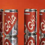
Ghia Non-Alcoholic Aperitif by Perron-Roettinger
In case you’ve missed it, low and no-alcohol drinks are a thing. With over 20% of adults in the UK claiming to be teetotal, abstinence is cool: Brewdog is now Punk AF (that’s ‘alcohol free’), Thomson & Scott’s Noughty is (fairly) nice, and Seedlip is sexy. This sobriety revolution is driven, in part, by the mindfully sceptical Gen Z, turned...
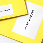
Marc Jacobs by Triboro
Fashion designer Marc Jacobs heads his own eponymous fashion brand, as well as diffusion lines The Marc Jacobs and Heaven by Marc Jacobs. He was also creative director at Louis Vuitton from 1997 to 2014, where he created the company’s first ready-to-wear clothing line. In his own words, Jacobs’ work is ‘a little preppy, a little grungy, a little couture’, and this...

andSons Chocolatiers by Base Design
andSons is a second generation chocolatier and retailer run by Marc and Phil Covitz, two brothers who learned everything there is to know about fine chocolate from their mother. Seeking to offer something new to the world of artisanal chocolate, driven forward by Top 10 Pastry Chef Kriss Harvey who joins the brothers, andSons thrashes out a liminal space between...
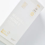
Rare Harvest by Marx Design
The True Honey Company (TTHC) dedicates itself to the production of mānuka honey, a monofloral variety produced in Australia and New Zealand from the nectar of the mānuka tree. It has a unique colour and texture and a high level of dietary Methyglyoxal, an organic compound with antibacterial and antiviral properties. With a price range starting at 60.00AUD and rising to 230.00AUD per jar,...