BP&O Collections — Minimalist Brand Identity Design
Opinion by Richard Baird Posted 8 December 2016
A collection of some of the more reductive brand identity programmes reviewed and published on BP&O. Featured studios include Mucho, Brief, and Neue, and cover a variety of clients, industries, and categories, from fashion and tech start-ups to architectural studios and product design companies. The work featured is reductive but well-intentioned, aesthetically restrained and communicatively precise. These often rely on simple forms, few type choices and solid colour. Be sure to click each image to read about the intentions of each design.
We Compost by Seachange


360ME, Montgomery+Evelyn by Studio Makgill

Åhléns by Happy FB

Arper 2018 by Clase bcn

The Architect’s Bookshop by Garbett

FranklinTill by Commission

Architects Accreditation Council of Australia by Toko

Broadgate by dn&co
![]()
Rimowa by Commission, United Kingdom

A.N Other by Socio Design, United Kingdom

Holvi by Werklig, Finland
![]()
Planned Living Architects by A Friend Of Mine, Australia

Institute by Commission Studio, United Kingdom

Superkül by Blok, Canada
![]()
PLATF9RM by Studio Makgill, United Kingdom

The Dayrooms by Two Times Elliott, United Kingdom

Edition by South, New Zealand

Artek Helsinki by Tsto, Helsinki, Finland

Capt by Bunch, United Kingdom

Corps Reviver by Spin, United Kingdom
![]()
ShopAround by Design by Toko, Australia

Soap Co. by Paul Belford Ltd, United Kingdom

Trika by Bunch, United Kingdom

Disrepute by Two Times Elliott, United Kingdom

Helbers by Only, United Kingdom

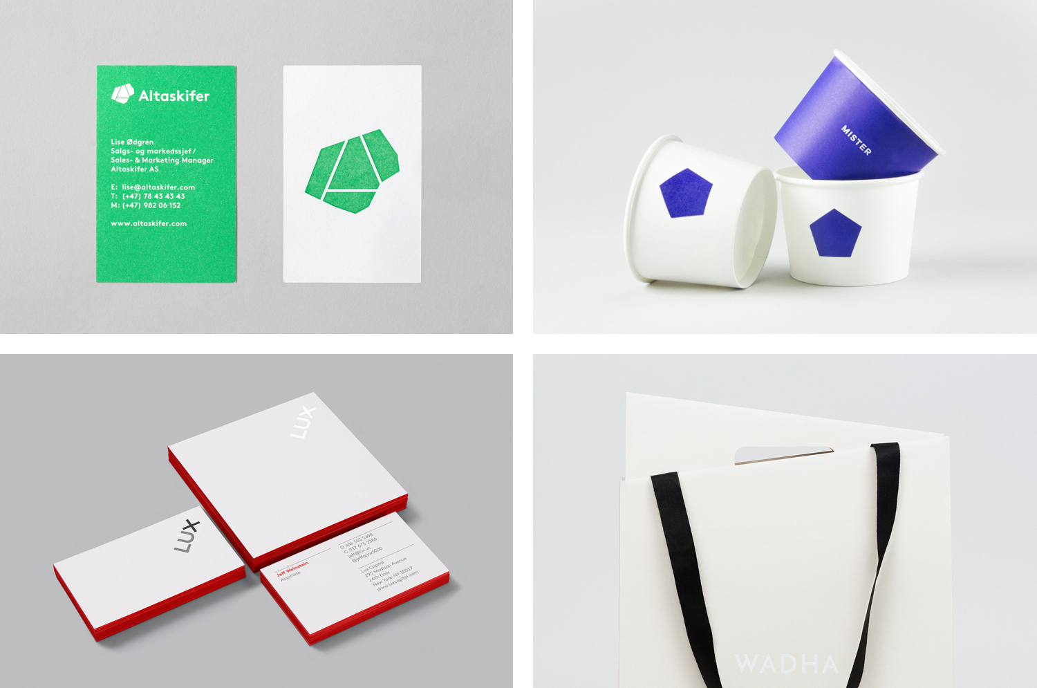
Lux Capital by Mucho, United States

Altaskifer by Neue, Norway

Wadha by Two Times Elliott, United Kingdom

Farah by Post, United Kingdom

Fathom Architects by dn&co, United Kingdom

NAU by Design by Toko, Australia

OTHR by Franklyn, United States

Designers’ Friend by Paul Belford Ltd, United Kingdom

Meg’s Tailoring by Studio South, New Zealand

Mister by Brief, Canada

Emma Magnusson Arkitektur by Lundgren+Lindqvist, Sweden

L’Observatoire International by Triboro, United States

The International by Studio South, New Zealand

Pia Ulin Photography by The Studio, Sweden

Norwegian Shipowners’ Association by Neue, Norway

Blå Bär by BVD, Sweden
![]()
Tulura by Build, United Kingdom

REF by Kurppa Hosk, Sweden

Bundlelist by Bunch, United Kingdom

A–TO–B by Stockholm Design Lab, Sweden

Maven by Design By Toko, Australia

MOAA Architects by Inhouse, New Zealand