Minke by Atipo
Opinion by Richard Baird Posted 8 December 2014

Minke is a Spanish print production studio that favours ‘analogue splendour’ over mass manufacture, providing its clients with a variety of small-scale, mechanical and handcrafted processes and print finishes. Their visual identity, developed by multidisciplinary design studio Atipo, reflects this philosophy and service through a mix of traditional and contemporary detail split across type, colour, material texture, print finish, pattern and die cut elements. Originally posted back in 2012 this project has been expanded upon and updated to include sample boxes and mail campaigns.
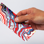
While the rationale that underpins the form of the logo remains a bit of a reach it continues to function well as a window, framing a variety of material detail. Contrast is used to great effect. This is not just limited to colour but also includes the coated, uncoated and large fibre textures of a variety of paper samples from merchants such as G.F Smith, Arjowiggins, Scheufelem and Torraspapel. Where Minke’s stationery favoured white boards, the sample packs run with black. The juxtaposition is equally as effective and also functions well to divide the intentions of the two.


Where the folders and single sheets deliver aesthetic impact, the sample boxes, under the theme Papers for Characters, looks to bind a broader collection through a shared narrative, drawing out the individual character of each using creative treatments inspired by film. These are brought to life through folds, burns, cuts, perforations and embosses. Like the identity, these are all underpinned by contrast. However, the sample boxes manage to layer this with a more creative quality that draws out Minke’s ability to deliver ideas and custom finishes.

As explored in BP&O’s original review, the contrast of classic and contemporary detail runs throughout Minke’s visual identity. These included, but were not limited to, a juxtaposition of abstract geometric mark alongside the editorial flourish and friendly informality of an all lowercase italic logotype, the technological sensibilities of the iconography and elements of repetition set against crafted flourishes.
The colour palette, again and fusion of past and present, unites these assets through the restraint and timelessness of white board and black foil, and contemporary highlights drawn from a variety of paper stocks. Like the sample packs, the business cards function as an opportunity to show off paper types, textures and finishes.

The result is a simple but well resolved union of contrasting type, form, colour and texture that work well to communicate paper and print finish quality, suggests a consistency in reproduction but with a creative enthusiasm, appropriately expanded upon through their approach to samples.
Design: Atipo
Opinion: Richard Baird