Norwegian Banknotes by Metric Design
Opinion by Richard Baird Posted 4 December 2014

If you consider all the tangible expressions of a country’s brand, money, with its essential function as a measure of value, could easily be considered one of the most important touchpoints. In this sense a country’s banknote is often the first point of physical contact with that place prior to travel. The shape, feel, colour, language, security features, artwork and heritage of currency informs the senses and begins to build perceptions. Norway understands this, and is about to show us all a little more of their personality, history and cultural identity through their new banknotes.
The story begins in the autumn of 2012; Norge Bank identified the need to enhance banknote security and ensure future resistance to counterfeiting. To attract as many creative and exceptional design proposals as possible, the bank held an open competition for the design of a new banknote series. The entries were gathered and then shortlisted, with eight remaining. These designs were selected by a jury composed of five external professionals and one member of Norge Bank. Ultimately, the team selected designs from two different companies. The design titled Norwegian Living Space by Metric Design and The Beauty of Boundaries by Snøhetta.
Norway is a small country but with a significant 83,000 km coastline, the longest in Europe, dominated by huge fjords that make the country home to some of the most dramatic coastal scenery in the world. As a coastal nation with a long seafaring history, one rich in marine resources, the sea has played a fundamental role in the development of Norway’s economic prosperity and national identity as well as many recreational and culinary traditions.
It’s no surprise that Norge Bank chose “The Sea” as the concept to underpin the design of its new banknotes. This decision breaks the tradition of featuring portraiture, something that has been used previously and extensively across many of the bank’s earlier design approaches.
Norwegian Living Space by The Metric System

The Metric System’s concept, titled Norwegian Living Space, takes a figurative approach to the theme of “the Sea.” by working with illustrator Terje Tønnesen for his precise photorealistic style. Tønnesen’s illustrations achieve a nice balance between traditional and modern expression, and feature a central element based on an individual phrase for each denomination. 50 kr – The Ocean that binds us together. 100 kr – The Ocean that brings us out into the world. 200 kr – The Ocean that gives us food. 500 kr – The Ocean that gives us wealth. 1000 kr – The Ocean that brings us forward. The design is described as being well suited to the incorporation of security elements due to be included in the next stage of the design process.


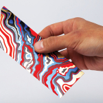
The Beauty of Boundaries designed by Snøhetta

Snøhetta’s concept is inspired by the impact Norway’s extensive coastline has had on the country’s identity, heritage and industry. Digital meeting analog, and pixel on paper becomes a metaphor for the long boundary between land and sea. Pixellated mosaics informed by different coastal details such as fishing boats and oil rigs divide the denominations. The use of the Beaufort wind force scale as a bearing for establishing increments of intensity in abstraction is a particular highlight. The 50 NOK note is subtle and gentle, and incrementally increases to the strongest intensity of abstraction seen in the long shapes on the 1000 NOK note.
Snøhetta’s design is partly based on the ideas and works of German physicist, Peter Richter. In particular, there are similarities to the book The Beauty of Fractals, which features complex mathematical computer generated imagery, these resonate throughout the technical detail of Snøhetta’s design.


The bank’s decision to select a theme based on a salient element of the country’s natural environment communicates an important aspect of Norway’s identity without coming across as ‘nationalistic’. In this respect the approach feels like that it is something ‘for the people’ and avoids any overbearing notion of authority or establishment in favour of a trustworthiness.
The competition catalogue, containing all the designs, is well worth a look, however, it is only available in Norwegian. While there are several great designs, I believe that the decision to combine designs submitted by Snohetta and The Metric System was an intelligent choice. Norwegian Living Space in its figurative realism captures a traditional concrete rational expression felt in our perception of physical reality, while The Beauty of Boundaries with its elegant and abstract expression, achieves an ambitious bearing with its openness to interpretation. The contrast of the two is a bold and ambitious fusion of tradition and modernity, retrospection and forward thinking.
Money has always been and will always be an idea. It’s an abstract measurement of value represented by the denomination that appears on each note. At a time when money is becoming increasingly virtual Norway will be the first country to graphically display the transformation of currency exchange in the digital age within its physical banknote.