Top 5 Packaging Projects of 2011
Opinion by Richard Baird Posted 22 December 2011
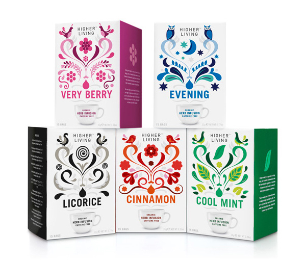
Higher Living is a herbal tea company with over 45 years of brewing experience using only 100% natural and organic ingredients. May 2011 saw the release of eight new herb and spice varieties with packaging designed by London based agency B&B that utilises a vibrant and striking illustrative style.
Fruit and herbal teas have often followed a fairly common visual style but B&B’s work for Higher Living took a fresh and vibrant direction with a distinctive and diverse illustrative aesthetic that manages to capture the aroma and flavour of a diverse range.
Read the full review here
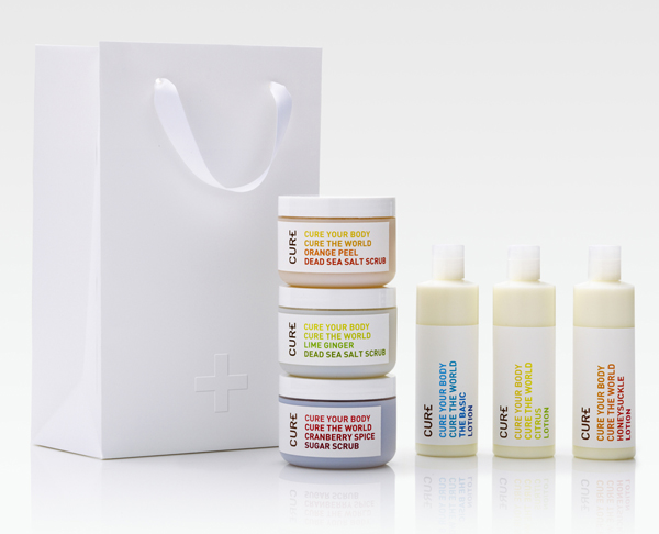
Cure is a new Californian based handcrafted body care company that formulates products to alleviate daily stresses and donates 20% of all purchases to global charities. The company’s branding and packaging was managed by multidisciplinary design studio Dowling Duncan and based around a simple logo-type solution and a clean, bright typographical labelling system.
Simple really works for the Cure brand. The plus sign drawn out of the logo-type has a really neat duality that resolves the aspects of effective ingredients and global aid. The typography is no nonsense and direct with a clear, open expression and a bold colour palette that compliments the tones of the product.
Read the full review here

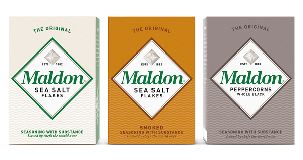
Maldon is a family run UK manufacturer of salts located off the east coast of Essex where it continues the two thousand-year old tradition of harvesting in the area. They approached Pearlfisher to redesign their packaging and branding to better capture and express the quality and heritage of the brand.
This is a great example of a clear visual hierarchy that manages to distil the products propositions into a very simple yet intelligent design solution that can essentially be broken down into three key elements, the product, its origin and its values.
Read the full review here
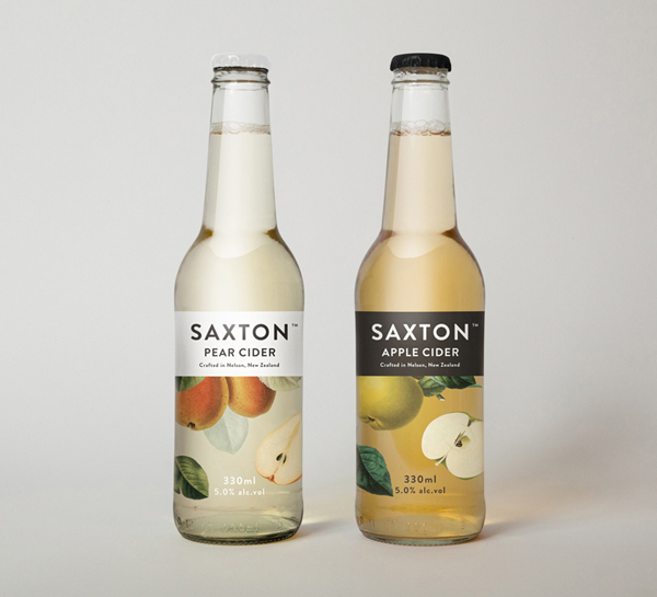
Saxton is a new range of ciders from New Zealand brewery McCashins developed for fresh food retailer Woolworth’s, Australia. The product’s identity and packaging, developed by designer Bradley Rogerson, utilises a classic 17th, 18th and 19th century botanical fruit print and engraving illustrative style to communicate a hand-crafted sensibility.
This piece received a lot of exposure during July and August and has won a number of awards, and for good reason. The smart use of classic botanical illustrations and simple typography communicates the product’s values in an effortless and a contemporary manner while looking premium without any of the conventional and contrived print techniques associated with high quality products.
Read the full review here
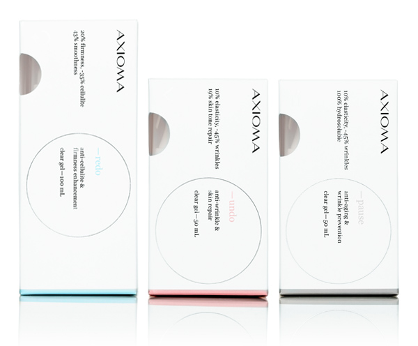
Axioma is a new brand of cosmetics that specialises in high quality and active skin care products. Their identity and packaging propositions were developed by Mexico based brand development agency Anagrama and utilise a clean and minimal aesthetic to communicate the clinical effectiveness of the ingredients.
Anagrama’s work for Axioma really represents where I want to be as a designer. The simple and smart balance of medical and prescription based aesthetics, small cosmetic twists and an interesting technological tone of voice delivers an elegant, unique and appropriately restrained aesthetic
Read the full review here</span