Packaging News

PURLOM’s ¡A LA MESA! by Onmi Design
I’m reluctant to bring up the pandemic again, four years later. But I can’t help think back to that period when seeing images related to gatherings, which are employed to great effect in Onmi Design’s work for PURLOM, a family business with more than 40 years of experience producing and distributing a wide variety of meats. This kind of imagery...

Ventura Foreman by Studio Blackburn
Founded by Robert Ventura and Sophie Foreman, Ventura Foreman is a design and manufacturing studio based in Woolwich, south London, which specialises in quality workwear pieces for clients like Paul Smith, Matches, and much-hyped North London ‘liberal metropolitan elite’ take on the greasy spoon, Norman’s Cafe. Having been around for a while without a ‘brand’, there came a point in...
Chilli Bomba by New Genre
Based in what’s been optimistically named London’s ‘Design District’, New Genre is a pretty youthful studio that’s racked up an impressively broad range of projects and clients in its short life. Just shy of two years old, the studio has thus far worked across fintech, a non-profit art organisation, a pub, a beauty brand, and a campaign for Jamie Oliver...
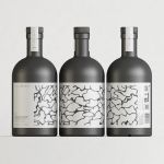
Black Bee Honey by OMSE
It was yesterday I made a run to the local supermarket to pick up some essentials. I had two choices, turn left to Waitrose or right to Morrisons. Despite being somewhat price conscious, I enjoy looking at the packaging at the higher-priced Waitrose, so went left–let’s say it’s the cost of being a designer. Anyway, honey was on the list....
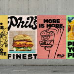
Phil’s Finest by Gander
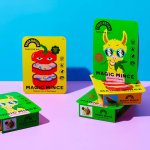
It’s a moot point now that the last few years have seen an explosion in all things vegan and ‘plant-based’ (a term arguably used lightly, when you consider the ingredients in many no-meat, no-dairy, no-animal product alternatives). There’s vegan cheese that actually tastes nice, there’s mushroom and hemp ‘magic mince’, even vegan tuna. I’m writing this while eating a vegan...
Food Nation by Seachange
It’s about time plant-based brands found their sense of humour. Having been a vegan for 17 years now, I can safely say that veggie/vegan brands have historically been tiresomely dull – and until recently, they’ve been allowed to be. But with the recent years’ boom in all things ‘plant based’, simply existing because there’s no other type of soy milk...

Graza by Gander
Using olive oil has never been so squ-easy. That’s how Andrew Benin, founder of Graza, would like us to feel. As Kelsey McClellan reports for the Wall Street Journal, Benin knew the last thing the world needed was another snobby olive oil and the key goal was finding ‘the sweet spot between flavor and affordability’. This product does feel different...
Divine Farmer by Base Design
International creative studio network Base Design is behind the branding for Divine Farmer, a California-based wellness company with an identity centred on New Age-style iconography and a heavy reliance on storytelling. Divine Farmer was founded by Polina Bowler, an acupuncturist and herbalist and owner of LA-based holistic wellness centre East Meets West who came up with the idea for the...

Eadem by Lotta Nieminen
The skincare industry is a varied visual landscape. At one end of the spectrum, brands like Glossier and Soft Services (reviewed July 2022) have found balance in softness and understated minimalism. At the other Dr.Jart+ (reviewed Jan. 2018) and Malin+Goetz bring pharmacy-chic with functional, type-led packaging. And then we have our classic, heritage brands – like Kiehl’s and Elizabeth Arden – which...
Unto by Studio Bergini
Five years ago, the discerning and culinary-minded were content with their everyday Waitrose Essential Extra Virgin Olive Oil. But now – as with wine – there is increasing awareness that the taste of oil is individual, depending on olive variety, soil type, climate, cultivation method, and a host of other factors. From The River Café’s hotly anticipated annual pressing to...

LBDO by Universal Favourite
Self-care is nothing new, but our understanding and appreciation of it as a society has grown enormously in the last half century, and especially recently when it became a trending topic during the isolation periods of coronavirus in 2020 and 2021 (70 million hashtags on Instagram, and counting). In the dawn of this enlightened thinking, products in this space have...
Still Waters by Makebardo
There’s a drink for all occassions. Could be with friends, out at a bar, in a restaurant, perhaps alone. There are also drinks that you might expect to take you away from the everyday, perhaps to a quieter more tranquil place, where torrent of ice water meets the churn of the sea. Still Waters, a New Zealand distilled gin and...