Logos for Photographers

Gustav Almestål by Bedow
Gustav Almestål is a Swedish still life photographer who has built an extensive, high-profile and international client list that includes the likes of Electrolux, Wall Street Journal and Hermes. He now works from Stockholm, following several years in London, on projects that range from advertising and editorial to food and interiors. The design of Gustav Almestål’s visual identity, which rested in the hands of Swedish...
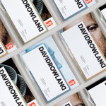
David Rowland by ico Design
David Rowland is an award-winning and straight-talking London-based photographer who has been capturing images for leading brands and agencies for over two decades. With a desire to remind existing and potential clients of his expertise and technical know-how David worked with graphic design studio and client ico Design to develop a new brand identity and supporting collateral. This included, alongside a new logotype, business...
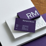
Richard Moran by Journal
Richard Moran is a lifestyle and portrait photographer with over 25 years of experience. He has worked with international businesses such as GSK, Pizza Express and Grey Goose Vodka, and secured a reputation as a passionate, straight-talking professional with a meticulous attention to detail and a portfolio of high-quality and emotive work. With a desire to communicate this and with the intention of...
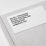
Pia Ulin Photography by The Studio
Pia Ulin is a Swedish photographer, working between New York and Stockholm, who has built a considerable reputation from her daylight-only approach. This is said to infuse her images, which cover interior, lifestyle and still life, with a warm and natural quality. As well as producing editorial photography for publications such as Dwell, Martha Stewart and Elle Decoration, Pia has also contributed...
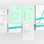
David Ryle by S-T
David Ryle is an internationally recognised and award-winning photographer with a studio in London. He has a portfolio of work that includes shots for The Sunday Times Magazine, JWT and Saatchi & Saatchi, and is represented across Europe and America by management agency The Peter Bailey Company. Drawing on his attention to detail and relentless pursuit of quality, design studio S-T developed...
Luka Žanić Photography by Studio8585
Luka Žanić is a Croatian interior and architectural photographer who works with clients worldwide. He approaches each project individually, gathering information about objects, spaces and their purpose before beginning a shoot. His brand identity, designed by Studio8585 and which included stationery, poster and portfolio folder, takes advantage of a typographically challenging set of characters in the form of a monogram and uses this...
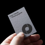
Peter Dibdin by O Street
Peter Dibdin is a photographer who brings creativity, technical knowledge, professionalism and a personal approach to both studio and location shoots for clients working within the commercial, private, arts and editorial sectors. Following a recent move to a studio in Edinburgh’s creative hub of Summerhall, Peter commissioned long-term collaborator O Street to refresh his brand identity in a way that would reflect his...
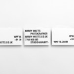
Harry Watts by Birch
Harry Watts is a British photographer who takes a systematic approach to location and explores the relationship between people and objects. His work has been exhibited nationally and internationally and was selected by Italian Vogue for solo exhibitions in London and Madrid. Harry’s brand identity, developed by London based studio Birch, is representative of his unique process of removing excess information through...
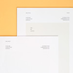
Peter Ahrens by Studio Jubilee
Independent London-based design agency Studio Jubilee have recently updated their website and portfolio. Their brand identity work for South Australian photographer Peter Ahrens—which included a new logo-type, website and stationery set—really stood out for its use of a weighty fluorescent white material choice and tactile print process to enhance a reductionist single font approach. The project is accompanied by a great write-up, published...
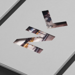
Frederik Laux Photography by LSDK
Frederik Laux is an award winning German portrait, fashion, lifestyle and editorial photographer with a client list that includes Alliance and Mercedes-benz. His new visual identity, developed by Stuttgart based design agency LSDK, takes a competently spaced but generic condensed, sans-serif logotype and executes it as a redacted three-line mark die cut by hand across a print solution that mixes...
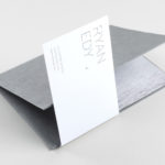
Ryan Edy by Founded
Ryan Edy is a UK based, award-winning advertising and editorial photographer whose clients have included Vodafone, Wilkinson & Wetherell and Innov-8. Design studio Founded worked with Ryan Edy to develop a brand identity treatment that, based around a simple, familiar but communicative framing device, also went on to include both print and digital portfolio design....
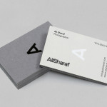
Ali Sharaf by Mash Creative
Ali Sharaf is a Bahrain-based commercial photographer who specialises in fashion, beauty and lifestyle images for the advertising and editorial markets. He describes himself as contemporary, upbeat, outspoken and edgy. Inspired by a shared interest in Swiss modernism and adopting a less is more approach, design studio Mash Creative developed a new brand identity for Ali that combines an iconic...