Pub Logos
Brass Union by Oat
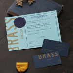
Located in the Union Square neighbourhood of Somerville, Massachusetts, Brass Union is a pub and cocktail bar with a small plate dinner menu. It takes over the space formerly occupied by the restaurant and music venue Precinct, both of which incorporated the historic nature of the building as a former police station into their names. To British readers, Brass Union would comfortably...

The Tokenhouse by Designers Anonymous
The Tokenhouse is a gastropub – run by hospitality brand Fuller’s – located on London’s Moorgate road. Designers Anonymous – the agency behind the branding of Fuller’s King’s Cross pub venture The Parcel Yard and fair-trade coffee range Brewer St. – developed a visual identity for the venue that appropriates 17th century history, gives it a contemporary vector treatment, a creative but cohesive diversity...