Design Reviews

Another Collective’s identity for smash burger brand Brusco deftly reinvents classic burger joint design tropes
Food trends are a funny old thing aren’t they. And just as design trends are never just about ‘aesthetics’ – the ‘what something looks like’ divorced from the world around it, food trends aren’t just about ‘edible stuff’, or ‘what things taste like’. Such movements both hold up a mirror to, predict, and feed back to us (literally, in the...
Koto breathes new life into Floridian arts institution The Norton
The Norton Museum of Art began life in 1941 in West Palm Beach, Florida, and in the near-century since, its whole raison d’être has been based around its role as a place where “art and life meet as a part of everyday art”. As such, it acts as more than a look-don’t-touch-style gallery space: the garden, gallery and restaurant are...
OlssønBarbieri rewrites the rulebook on ‘formality’ in its melodrama-infused Theaterbaren identity
Oslo’s Nationaltheatret (simply translated to English as National Theatre) first opened its doors more than a century ago in 1899, and has since come to not only reflect, but actively shape cultural identity in Norway. Having staged everything from more traditional Norwegian dramas from the likes of Henrik Ibsen to experimental contemporary works, the building itself is also a marriage...
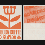
Mecca Coffee by Christopher Doyle & Co.
Sydney-based Mecca Coffee started life in 2005, and has since become one of the city’s leading specialty coffee roasters, importers, and retailers. To mark the company’s 20th anniversary, Christopher Doyle & Co. (Ortto, Machine Screen Printers, New Aim), which is also based in Sydney, was brought in to evolve its brand identity across “packaging, merchandising and collateral systems,” Doyle explains....
Strangers by Auge Design
Strangers is a new confectionery brand created by Valgosa, a family company dating back to 1912 and seemingly best known as purveyors of saffron. It seems an unlikely starting point for such a boldly positioned brand – and one boasting an exquisite visual identity thanks to Milan-based Auge Design (Erbert, Ginori 1735). According to Auge – which worked across everything...
NoomaLooma by Cotton
NoomaLooma is described as a “platform built around small moments of making”. As far as I can tell, it’s an app in its early stages (at the moment, it’s just for iPhone), and it’s launched with a brand identity created by New York studio Cotton (the design team behind the excellent identity for Eternal Research). The platform was created by...
Dataforeningen by Bielke & Yang
Dataforeningen simply translates as ‘data organisation’ from Norwegian to English, and funnily enough, that’s exactly what the organisation is. Operating nationwide across Norway serving people working in tech, it was looking for a new identity that reflected a shift in who and what it was, and its future aims. Taking on this potentially tricky brief was Oslo-based Bielke & Yang...
Pumpkin by Kuba & Friends
Another week, another branding project for those – love them or loathe them – ‘pet parents’. I honestly thought we were post-pet-parent, but seemingly we’re still very much in the midst of that icky phrasing – the “live, love, laugh” of dogs, a sort of endless bottomless brunch with the #girlies. I’m an ‘elder millennial’, but it all seems disgustingly,...
Six Six by A Friend of Mine
Six Six is an eyewear store and optometrist based in Melbourne, which opened early this year with the aim to be “more like a destination than a store”. Tasked with creating the brand identity to make that happen was A Friend of Mine, or AFOL for short (Embla, Great Wrap, Suupaa), a brand design studio also based in Melbourne which...
Nu-clear your skin
Juana is a Dubai-based company creating CBD-based “bioactive” skincare, founded by Yann Moujawaz Martini, a French-born entrepreneur with Syrian roots and a background in brand strategy or – as he himself put it in an interview – “a decade designing multibillion-dollar wellness and medical tourism mega-projects for governments and Fortune 500s”, after which, he says, he “flipped the script” and...
Off-kilter and elevated
St Paul’s Cathedral is undoubtedly one of the most iconic, recognisable landmarks of London’s skyline: its vast dome, all beautiful copper-tarnished turquoise, resplendent with dazzlingly golden pineapples (one of its architect Sir Christopher Wren’s favourite accoutrements, and back in the 17th century a distinct status symbol representing all that was bountiful and exotic). Until 1963, St Paul’s was the tallest...
Gaptooth Soda by Saint Urbain
One person’s imperfection is another’s luck– especially, it turns out, when it comes to teeth. The front-tooth-gap, as exemplified and celebrated by the likes of Madonna (and, it turns out, Chaucer’s famously, unabashedly lustful “gap-toothed” Wife of Bath) is known in more scientific or medical terms as a ‘diastema’. Many see this aesthetic dental quirk as attractive; others not so...