Spanish Design
IAAC by Mucho
The IAAC (Institute for Advanced Architecture of Catalonia) is an organisation which boasts a remit that feels both nigh-on impossibly wide but also hyperspecific. Based in Barcelona and founded in 2001 as a hub for innovation in architecture and design, IAAC describes itself as ‘a platform for producing knowledge to shape the future of cities, buildings and society’. The long...
Pamipe by Omni Design
In recent years we’ve seen some radical shifts to the ever-booming pet care sector. That’s thanks in no small part to the Covid 19 lockdowns that saw many of us seeking solace and company in domestic animals, taking advantage of the WFH policies that, once upon a time, felt endless and unwavering. Another catalyst, perhaps, is that in an increasingly...
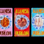
PURLOM’s ¡A LA MESA! by Onmi Design
I’m reluctant to bring up the pandemic again, four years later. But I can’t help think back to that period when seeing images related to gatherings, which are employed to great effect in Onmi Design’s work for PURLOM, a family business with more than 40 years of experience producing and distributing a wide variety of meats. This kind of imagery...
New York Botanical Garden by Wolff Olins
It must be something of a dream project when an agency gets commissioned to work on those big-name cultural clients – museums, art galleries, orchestras, theatre companies, et al. You’d expect such projects to be a departure from the constraints and stakeholder-limitations of corporate clients; and perhaps a chance to be more creative than usual, thanks to the nature of...
Knahia by Requena Office
Estepona is a Spanish resort town on the Costa del Sol. It surveys the azure waves of the Mediterranean from the apex of a bight that traces a gentle South-Westerly arc from Marbella to Gibraltar. Strewn as it is on this notoriously idyllic coastline, Estepona largely conforms to the stereotypically cheerful charm of the Spanish resort town, pandering to the...
La Oficina del Parque by Studio Ingrid Picanyol
Last month @designershumour shared a meme titled, ‘When I ask my client to send their logo in vector format’. The god-tier client supplies logo.ai, from which point there’s a sliding scale of disgust and incredulity from logo.psd to logo.jpg and logo.doc. The punchline is logo.xls. The joke resonated, attracting over 30k knowing likes (or eyerolls). At one point or another,...
Panettoni Pavolucci by Requena Office
Panettone has origins as far back as ancient Rome, but its connection to Christmas was first established in the eighteenth century. This sweet bread – originally from Milan – has earned its place across the globe as a staple of the festive season. However, earlier this summer, Barcelona-based twins Chiara and Francesca Pavolucci opened a bakery to bring panettone to...
Brutal Burrito by Tres Tipos Gráficos
In 1984, the death of the wrestler Rodolfo Guzmán Huerta – commonly known as El Santo – sent shockwaves through Mexico. Over the course of five decades and 15,000 matches, the legendary fighter had captivated audiences, helping to fuel the growth of Lucha Libre around the world. Through his appearances in film, comic books and cartoons, he established himself as...
Queremos Sonreír by Mucho
Queremos Sonreír – Activar la Cultura Local (We want to smile – Activating local culture) brings together the voices of a variety of cultural agents–from citizen collectives and activists to artists and managers of cultural programmes–who are generating actions that intend to stimulate local culture, empower citizens, develop learning processes and further critical thinking. Through these voices the book explores questions around citizen...
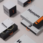
DOIY Honom by Folch
Honom is a new “male-oriented” range from Barcelona-based DOIY, a product design company creating objects that move between the practical, the ornamental and the more whimsical. Honom veers heavily towards the former with objects that include a wallet, multitool, bottle opener, keyring and bike bell. In their design, materials and build these find a balance between everyday utility and premium positioning....
Arper 2018 by Clase bcn
Arper is an Italian furniture company producing chairs, tables and furnishings for community, work and home spaces. They seek an elegant resolution of function, form and finish which is founded on a total design philosophy that covers design, production and long-term impact. Arper commissioned Spanish studio Clase bcn to develop and design a new on and offline graphic identity for all...
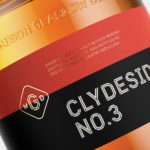
The Clydeside Distillery by Manual
The Clydeside Distillery was set up in 2014 with the intention of reviving distilling in Glasgow and telling the story of Scottish Whisky through a visitor’s centre. The distillery was set up by the Morrison’s, a family with a century-long history within the Scottish Whisky industry as both owners and operators. San Francisco based Manual travelled to Glasgow to work closely with founders, architects...