Ink Stamps
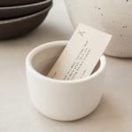
Natasha Alphonse Ceramics by Shore
Natasha Alphonse is a ceramic artist raised in the Saskatchewan province of Canada who now works from a studio in the US city of Seattle. Her ceramics are characterised by a mix of simple forms, irregular surfaces and an earthiness in colour and texture. With a desire to scale her brand into a viable business Natasha worked with American graphic design studio Shore to develop...
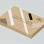
Husler & Rose by Post
Husler & Rose is an online boutique and occasional pop-up store that retails thoughtfully designed, carefully constructed and long-lasting furniture, homeware and lifestyle objects sourced from across the UK and Europe, professionally and sensitively restored by owner and furniture maker Ben Rowland. Inspired by Herbert Bayer’s Bauhaus posters and the jazz record sleeves of Duke Ellington, London based graphic design studio...
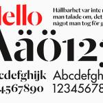
Essem Design by Bedow
Bedow worked with Essem Design, a Swedish manufacturer of ‘artisanal hallway interiors’ to develop a new brand identity treatment. This included logotype, advert, catalogue, product sheet and stationery design based around “Hej—Hej då”, hello and goodbye in Swedish, a reference, Bedow explain, to the most common phrase used in the hallway....
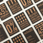
Miinus by Bond
Miinus is kitchen created by Finnish furniture manufacture Puustelli. As the name suggests, Miinus was developed around the philosophy of reduction, the process of removing superfluous elements to leave only the minimum, most functional aspects intact. Helsinki based design studio Bond where commissioned by Puustelli to develop a brand identity for the kitchen that would extend across stationery, print, retail and exhibition spaces. By utilising...

Puebla 109 by Savvy
Puebla 109 is a three floor 20th century townhouse, located in the Roma Norte colonia of Mexico City, “where art, design and gastronomy converge” in the form of an evolving space utilised as a place to work in the morning, as a restaurant to eat lunch in the afternoon and as a bar to have cocktails in the evening. Puebla 109’s new brand identity—which includes...

Matthew Hilton Watch by Spin
Matthew Hilton is a designer working with De La Espada to bring together craftsmanship, premium materials and advanced manufacturing technologies to produce high quality furniture. Spin, the agency responsible for developing Matthew Hilton’s brand identity, have recently completed the packaging of his first time piece as well as the print for the launch event. Spin’s juxtaposition of low-fi corrugated card,...

No. Six Depot by Perky Bros
“No. Six Depot is a family owned, small-batch coffee roaster and café nested in the beautiful Berkshires. Located in a historic train station on 6 Depot St, they serve teas, salts and coffee from small farms and roast on location. Their identity [designed by Perky Bros] juxtaposes a mix of unique rural and modern elements — drawing inspiration from their own backyard railroad...
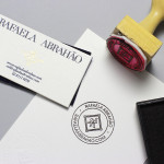
Rafaela Abrahão by BR/Bauen
Brazilian fashion blogger Rafaela Abrahao recently commissioned design agency BR/Bauen to develop a new visual identity that would extend across her website and stationery. Drawing on Rafaela’s favourite brands, Prada, Versace and Hermes, and an interest in English nobility for inspiration, BR/Bauen developed a solution that unites the fine illustrative detail and typographical flourish of a blackletter monogram executed with a contemporary and consistent...
Helsinki Food Company designed by Werklig
The Helsinki Food Company provides design and production services – including consultation, styling, photography and recipe development – to regional broadcast, print and event sectors. Created by visual communications agency Werklig, their visual identity – an economical single colour print treatment of a logo-type constructed from a single consistent line weight and culinary-related letter-forms across a variety of tactile and dyed craft substrates – sets...

Askeroths Trappor Och Räcken by Bedow
Stockholm based graphic and product design studio Bedow recently developed a new visual identity and stationery solution for Askeroths Trappor och Räcken, a small Swedish manufacturer of specialist staircases. Based around a simple but identifiable abstraction, the logo-mark captures the elemental, functionality and practicality of staircases and the solid technical abilities of the craftsmen through the combination of a single, consistent line weight, basic geometry...