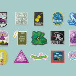
Stickers
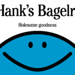
Hank’s Bagelry by Studio Ongarato
Sometimes, a brand identity can be deeply strategic, have a rich heritage or an involving narrative. Other times, it can be simply eye catching and cool. Suites of custom designed icons, art directed photography, tone of voice, motion behaviours, programmatic graphic elements and bespoke in-house content generating tools…. not every brand needs these. They’re colours to paint with. I call...
TwelveLabs by Pentagram
Remember when the conversation around gradients was about making ‘bad’ design look ‘better’? When RGB colours were frowned upon because you couldn’t print them? Yeah, those ideas feel a bit outdated now. HP Indigo can now run fluorescents affordably, and business card mock-ups (in RGB) are more about selling than printing. Technology marches on, expectations and standards evolve, and everything...
Bettr by Anak
Between the late 2000s and the early 2010s, the coffee industry turned its attention to ‘craft’, elevating the beverage to a gourmet offering. When it came to brand storytelling, flavour notes, provenance and sustainability became key components. These features came to define what’s now known as ‘third-wave coffee’, which pre-dates the gamified science-infused ‘fourth-wave coffee’ movement in terms of textures...
Jaffa by Earthling
This took me probably longer than it should have to get my head around, but bear with me: Jaffa oranges – also known as Shamouti oranges in Arabic – are a specific variety of orange cultivated in Israel, Palestine, Cyprus, Iraq, Lebanon, Syria, Jordan and Turkey, known for their relatively few seeds and tough skin. These qualities make them especially...
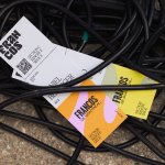
Francos de Montréal by LG2
Les Francos de Montréal is Canada’s premier festival of French language music and culture. Held annually in downtown Montréal, it is a fixture in both the social calendar and cultural life of the city, and the wider francophone world. This year’s edition of the festival has been given a sophisticated new look, courtesy of LG2, Canada’s largest independent creative agency...

Pilo by 5.5
Youth hostels aren’t exactly associated with luxury – nor great branding. For the most part, they’re deemed the cheap and cheerful option; a trip where home comforts are sacrificed for socially minded living, affordability, and a more adventurous sensibility than the average Travelodge. They’re the sorts of places where creaky bunk beds, shower queues, pillows so thin they’re barely more...
Florentia Village by DNCO
On first hearing, ‘Florentia Village’ is a ridiculous name for a warehouse complex in South Tottenham, as if Hyacinth Bouquet had somehow risen from the grave and gained a seat on the borough council in order to render floridly Italianate a grimy chunk of East London. However, the name does in fact arise from an organic nomenclatural etymology: indicating ‘flourishing’ or...
Mill by Manual
There’s a lot to be said for the Instagram-worthiness of, say, a faux-futuristic beauty brand identity that’s all gloopy, metallic, kinetic typography, ‘terminal green’, and unabashedly Gen Z-baiting ‘y2k’ art direction. It’s easy to assume that projects that allow designers the creative freedom for unabashed experimentation – playing fast and loose with legibility and lofty conceptual thinking – are the...
Top of the Mornin’ Coffee by Earthling
Anyone over about 25 would likely feel that of all people, big-time YouTubers aren’t exactly in need of a coffee fix: high-octane, breathless excitement and endless, pause free chitchat don’t exactly scream ‘3pm slump’. However, Irish YouTuber Seán McLoughlin, aka Jacksepticeye – who boasts more than 52 million social media followers, and nearly 16 billion views on YouTube alone –...
Veg NI by Jack Renwick Studio
The economics of regional farming, in the face of global market forces, continues to be unfavourable to local producers; narrowing margins and pushing some out of business. Alongside this, unfair and self-defeating politics continue to chip away at a basic message; locally grown food is a good, not just in a regional economic sense, but in terms of the health...
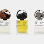
.Oddity Fragrance by .Oddity Studio
In July 2019 New York-based Stefan Sagmeister and Jessica Walsh announced that they would be splitting their shared practice after nearly a decade of innovative and boundary-pushing work together. In the amicable separation, &Walsh took over the commercial projects while Sagmeister announced he would exclusively be working on ‘self-generated design’ under Sagmeister Inc. Having made his millions, Sagmeister’s days are...
Seedsman by Here Design
Water masquerading as an edgelord-baiting energy drink (Blackletter fonts, skulls, and a name straight out of the heavy rock canon); running shoes aping a chesty cough remedy; olive oil bottles that owe more to the science lab than the Mediterranean. Packaging at the moment, it seems, is frequently playing fancy dress. That’s no bad thing, of course: brands borrowing aesthetics...