Sweet Packaging
Chilli Bomba by New Genre
Based in what’s been optimistically named London’s ‘Design District’, New Genre is a pretty youthful studio that’s racked up an impressively broad range of projects and clients in its short life. Just shy of two years old, the studio has thus far worked across fintech, a non-profit art organisation, a pub, a beauty brand, and a campaign for Jamie Oliver...
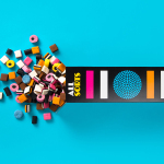
Allsorts by Bond
Lovely new packaging design by Helsinki based studio Bond for liquorish confectionery brand Allsorts that brings the “distinctive shapes and colours of the liquorice into the forefront of the design” with simple, iconic geometric illustrative detail and a bright colour palette, enhanced by the black background of a card box structural solution. An approach described by Bond as resulting in a “bold...
Jealous Sweets by B&B Studio
Jealous Sweets is a gelatine and gluten-free confectionery range made with natural fruit juices and no artificial flavours or colours. Design agency B&B studio were recently commissioned to develop a new visual identity and packaging solution for the range that would focus more on its premium position and purity of ingredients. Developed under the theme of ‘covetable candy’ – “a concept...
Caramela by Anagrama
Caramela is a Monterry-based chocolate boutique and caterer that creates traditional treats inspired by European pastries. Their identity, designed by independent design agency Anagrama, is an unusual but striking mix of a sweet neon pink and clinical white, a subtle 80’s retro-fashion polkadot pattern, the practical/industrial and craft aesthetic of an unbleached and uncoated substrate, adhesives and white screen print, finished with a simple but...