Video
The Art Gallery of New South Wales by Mucho
The Art Gallery of New South Wales, founded in 1872 as the New South Wales Academy of Art, suffered from a fragmented brand architecture. Addressing this through a rationalised and simplified system, and reinforcing the master brand across all Gallery collateral became a central part of developing of a new brand identity which would support a repositioning strategy that moved...
Autex Acoustics by Marx Design
With manufacturing and sales teams throughout Australia, UK and the USA, Autex has grown to become the market leader in interior acoustic products in New Zealand, and the go to choice for leading architects aspiring to reduce the amount of atmospheric noise within cutting-edge residential and commercial spaces. Their products are innovative, produced in a variety of forms and colours,...
Piedmont Art Walk by Mucho
Piedmont is a small city in California named after the European region in the shadow of the Alps (from the Italian piemonte, meaning ‘foothill’). Surrounded on all sides by Oakland, the neighbourhood has a population of roughly 10,000 people and an active charity scene. This includes the Piedmont Arts Fund, a nonprofit group that promotes and supports visual and performing...
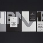
VBMS by Studio Dumbar
Visser & Smith Marine Contracting is the market leader for subsea power cable installation in Europe. It provides and lays grid-to-grid connections for offshore wind farms and similar facilities. Following investment from and partnership with dredging and marine experts Boskalis, Studio Dumbar worked with VMSC, now named VBMS (VolkerWessels Boskalis Marine Solutions) to provide strategy, brand identity and creative direction that would help launch...