Review on The Dieline: Bolthouse Farms
Posted: June 6, 2012 Filed under: Food & Drink, Packaging | Tags: Bolthouse Farms, bottle, condiment, design, dressing, gourmet, graphic design, label, packaging, premium, US, yoghurt Leave a comment »Established in 1915, Bolthouse Farms is a grower and manufacturer of food products for the US market. In a bid to meet increasing consumer demand for low fat natural products, Fairfield, Connecticut based brand and packaging development firm HMSDesign was commissioned to redesign their range of seven, yoghurt based dressings.”HMSDesign refreshed Bolthouse Farms’ entire line of all natural Yogurt Dressings, encompassing 7 flavors, further leveraging the brand’s iconic visual equities as it continues to lead the category. The design challenge was to increase brand presence, appetite appeal, and meet consumer demand for all natural products that have low fat and low calories, all with great taste!”- HMS Design
Click here to read my review and share your own opinion of Bolthouse Farms on The Dieline.
More Crits from Richard Baird published on The Dieline
Packaging: Emmi Yoghurt
Posted: July 29, 2011 Filed under: Food & Drink, Packaging | Tags: Art, design, Emmi, illustration, packaging, packaging news, review, Studio H, Swiss, yoghurt 3 Comments »
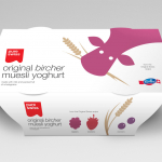
Swiss Plus is a range of yoghurt products from manufacturer Emmi. As part of a re-brand, London based Studio H created a new simpler packaging solution that avoids the usual clichés and utilises a straightforward illustrative style for the UK market.
Packaging and Branding: Good Heavens!
Posted: May 31, 2011 Filed under: Food & Drink, Logos & Branding, Packaging | Tags: B&B, design, Drink, Good Heavens, packaging, yoghurt Leave a comment »Bio Green Dairy is a UK producer of drinking yoghurt that blends real fruit and good bacteria. As part of a brand overhaul they turned to London based design agency B&B to develop a new name, identity and packaging proposition that would deliver a stronger presence in an increasingly saturated market. Now retailing under the name Good Heavens! and labelled a ’boutique dairy’ the product has been repositioned as “..indulgent” and “feminine”.
Branding: Will & Jamie’s
Posted: April 27, 2011 Filed under: Food & Drink, Logos & Branding | Tags: branding, design, Designers Anonymous, fruit, identity, labels, logo, packaging, smoothy, Will and Jamie's, yoghurt Leave a comment »Will & Jamie’s is a new joint venture between Welsh dairy farmers Will Prichard and Jamie Adams producing and distributing a range of fresh yoghurt drinks. Their new name and identity was designed and developed by London based design agency Designers Anonymous.


