Swing Tag Design

Doméstico Shop & Doméstico Market by Mucho
Doméstico Shop is online retailer of designer homeware which has grown to become the leader in the Spanish market. It stocks an array of items, from furniture and kitchenwear to textiles and lighting. To coincide with the launch of Doméstico’s concept store Doméstico Market, and the opening of a new flagship store in Barcelona, the retailer worked with Mucho to...
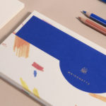
Maisonette by Lotta Nieminen Studio
Maisonette is an American online retailer of luxury children’s brands, founded by former Vogue co-workers Sylvana Durrett and Luisana Mendoza Roccia. The retailer carries a carefully selected yet extensive catalogue of clothing, homeware, gifts and accessories that mixes local up-and-coming brands with those that are well-established and international. Maisonette’s visual identity, designed by New York based Lotta Nieminen Studio, intends to balance and juxtapose a...
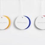
January Moon by Perky Bros
January Moon is a range of contemporary teething jewellery from American artist and designer Jenny Luckett, created in response to the birth of her son and in the discovery she could no longer wear her favourite pieces. The range intends to satisfy the stylistic sensitivities of modern mothers while also aiding their child’s development. The range is characterised by a variety...

The Dayrooms by Two Times Elliott
The Dayrooms is a multi-label womenswear store, located in the London district of Notting Hill, created by Aytan Mehdiyeva and Zumrud Mammadova. The store gives a UK platform to emerging Australian designers and is an expression of Aytan and Zumrud’s shared passion for fashion and travel, and Aytan’s love of photography, textiles and Australian craftsmanship. This is reflected throughout The Dayroom’s graphic identity, developed by Two Times...
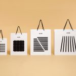
Artek Helsinki by Tsto
Artek is a Finnish furniture and product design business and retailer with a flagship store in Helsinki. It was founded in 1935 by architect Alvar Aalto and wife Aino Aalto, the arts promoter Maire Gullichsen and art historian Nils-Gustav Hahl. Artek grew alongside and shared many of the qualities of the 20th century modernist movement, blending art and technology, and making the...
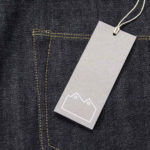
Blackhorse Lane Ateliers by StudioSmall
Blackhorse Lane Ateliers is a UK-based premium selvedge and organic raw denim jeans brand. It was founded in 2016 by Han Ates, who has over 25 years experience in the textiles industry, and is located in a renovated 1920s factory building with a distinctive profile in Walthamstow, North London. Blackhorse Lane Ateliers is committed to implementing a sustainable and ethical production model....

Modern by Dwell Magazine by Collins
Modern by Dwell Magazine is a new range of home decor products, tablewear and furnishings for those who want to create a welcoming space with a modern aesthetic. It is a collaborative project between design and architecture magazine Dwell, designers Chris Deam and Nick Dine of Deam+Dine, and the American retailer Target. The range features over 120 products. From chairs, tables and glassware to kitchen utensils,...

Lorod by Pentagram’s Natasha Jen
Lorod is an American fashion label that redefines timeless basics with modern, modular construction, distinctive fabrics and vintage-inspired chic. The designers at LOROD experiment with production methods to give each garment a quirky, personal and one-of-a-kind quality, and utilise new distribution tools to produce collections within the U.S. This intersection of the classic and contemporary, refined craftsmanship, a utilitarian functionality and quirky personality informed Lorod’s brand...

Qoñi by Leo Burnett
Qoñi is a small artisan community in the Peruvian city of Puno creating hand knitted socks, scarves, gloves and shawls from alpaca fleece. With a desire to present itself as a modern fashion brand and with the intention of entering the international market, Qoñi worked with Toronto-based graphic design studio Leo Burnett to develop a new visual identity; from naming to wordmark, brand story to lookbook, and...
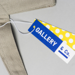
Gallery & Co. by Foreign Policy
& Co. links museum shop, a food and drink retailer and cafe housed within the National Gallery Singapore. These share a brand identity designed by Singapore-based graphic design studio Foreign Policy, built around the basic foundations of modern art and design; primary colour, geometric form and repetition, and Grilli Type’s GT Pressura. This runs across and unites a variety of printed materials that includes, but is...
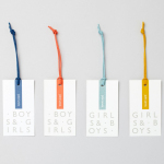
John Lewis Childrenswear by Charlie Smith Design
London-based studio Charlie Smith Design worked with British department store John Lewis to develop the visual identity system and packaging for their childrenswear department. The system needed to appeal to girls and boys aged from 2 to 14 (and presumably their parents), and connect a broad range of accessories and garments that included denim, swimwear, shoes and underwear. The result is as a...
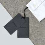
Helbers by Only
Helbers is a Parisian menswear label created by Paul Helbers, the former Head of Menswear at Maison Margiela and ex-Menswear Director at Louis Vuitton. The label has a carefully curated lookbook of garments and footwear with an unpolished elegance, and feature a subtle contrast of materials. Helbers has secured early acclaim for his AW16 collection, and is due to appear in stores around the world in the coming weeks. Paul worked with Leeds-based...