Matchstick Coffee by Vitae
Opinion by Richard Baird Posted 11 June 2012
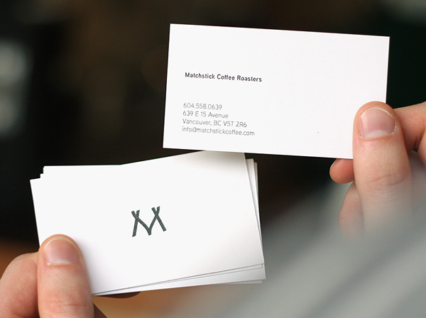
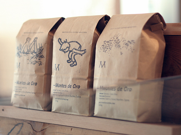
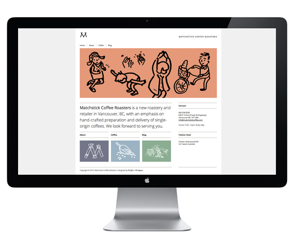
Matchstick is a Canadian coffee roaster and retailer that specialises in the hand-crafted preparation of single origin beans sourced from Columbia and Guatemala. Matchstick’s branding and packaging, designed by Stockholm based independent designer Cameron McKague, working under his agency Vitae and in collaboration with Dirk Wright, was created to evoke the warmth and charm of its founders through a playful illustrative style and monogram.
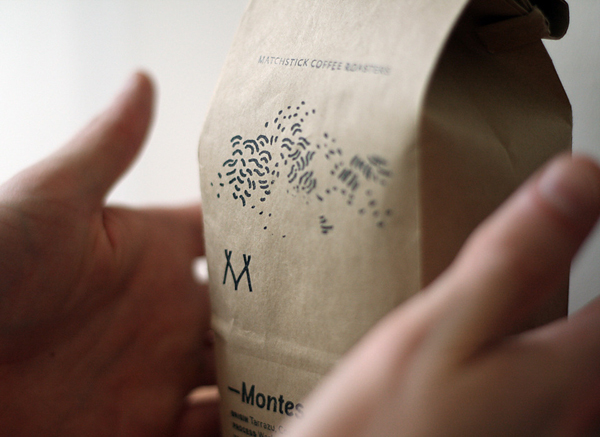
I have, on occasion, perhaps drawn too much from some of the identities reviewed on BP&O but, and pull me up if you think I am wrong, for me, Cameron and Dirk have managed to build a simple mark with what looks like a divining rod at its centre, a really smart and what I think is a pretty unique visual analogy of the sourcing and provenance of ingredients. Its angled terminals, consistent line weight and single colour have an calligraphic aesthetic that infuses the mark with a subtle sense of handcraft and shares the elemental quality of unground coffee beans. The monogrammatic approach, currently undergoing a bit of a renaissance (and increasingly for businesses that have little to do with personal service) feels appropriate and suitably reflective of the added value, service and coffee making expertise Matchstick’s baristas bring to such a commodity.
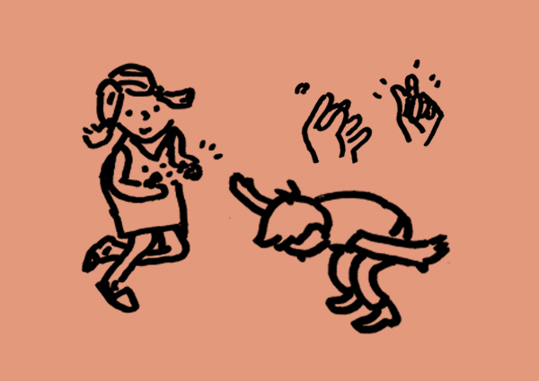
The uncoated, unbleached and tactile nature of the packaging substrate and single colour print treatment really expands on the craft aesthetic established by the mark, neatly represents the coffee’s untreated nature and offers an underlying, elemental, utilitarian aesthetic that really captures the imported aspect of coffee and the developing regions it is sourced from. Across the front a set of loose, hand drawn illustrations carry an interesting, authentic charm, distinctive character and charcoal-like finish that works really well to differentiate coffee varieties with a confident simplicity, honesty and earthiness that compliments the material choice, spacious layout, typography and the narrative detail.
Combined each asset adds to the depth and richness of the brand experience, effortlessly unifying the themes of craft, origin, authenticity and individual character but with a visual calmness and restraint.
