Under Your Skin by Robot Food
Opinion by Richard Baird Posted 27 January 2014

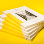
Under Your Skin is a specialist tattoo and skin care range made up of three treatments; ‘Recover’, ‘Protect’ and ‘Enhance’, developed in response to skin art’s move from sub-culture to the mainstream.
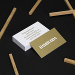
Under Your Skin’s brand identity—which included a logotype, original illustrative work and packaging design, developed by Leeds-based Robot Food—was created to appeal to a broad audience, “from the newly marked” to “the most hardcore tattoo lover”, whilst staying “true to the culture and heritage of tattooing” says lead designer Mike Johns.
Robot Food’s press release is refreshingly open about their intentional leveraging of ‘hipster-style typography’ to construct the logotype. The contrast of large condensed sans-serif, geometric sans-serif and typewriter slab-serif, resolved with a structure that mirrors those of heritage brands, popular tattoos and indeed bordering on hipster, is well executed with a good eye for space and layout.
The proprietary tweak of the U is playful and unapologetically appropriates what might be perceived as a cliché and neatly integrates this into the logotype. As an anchor sits ‘under’ the surface of the sea and a tattoo ‘under’ the skin, this detail feels like smart way to temper an expected form with an appropriate relevance.


A typographic simplicity and space is met by the detail and density of the illustrations. Like the anchor of the logotype, Robot Food take full advantage of the iconic and established images of the industry—skulls, anchors, hearts, swallows, ribbons and roses—to reach the wider, global market, in an accessible and communicative manner.
“We wanted to support and complement traditional tattoo culture with a minimalist, modern cosmetics range that would appeal to all that are inked. Our in-house illustrations of a burning heart, Spanish skull and swallows and anchor are iconic symbols worldwide. They capture tattooing’s essence and also reinforce each product’s USP.” – Mike Johns, Lead designer, Robot Food.
Each illustration is very well rendered with a by-hand and authentic sensibility that leverages the craft of the skin art industry to help convey the quality of the products and have a brightness that neatly alludes to the product’s enhancement and retention of tattoo colour and detail. These are enhanced by the clinical qualities of plenty of white space, a direction that Robot Food rightly describe as ‘cosmetic credibility’, a sharp touch that infuses the products with an effectiveness by borrowing an established convention from cosmeceutical industry.

The result is an on-trend and broad accessibility, expected in some ways and perhaps not as risky, edgy or reflective of its sub-culture origins as it could have been, however, manages to balance quality, effectiveness and a compelling and communicative aesthetic well. More from Robot Food on BP&O.
Design: Robot Food. Opinion: Richard Baird. Fonts Used: Brandon Grotesque, Arvil Sans & American Typewriter.