March’s Top 5 Projects 2013
Opinion by Richard Baird Posted 29 March 2013

Marks is a Geneva-based multidisciplinary design studio that specialises in delivering contemporary graphic communication solutions to corporate business, institutions and the luxury goods and industrial art sectors. Their visual identity, a reverse, uppercase italic logo-type with a consistent line weight, humanistic sans-serif detail, decent spacing and neat parallel diagonal strokes. Now features across a new stationery set that, through a really nice combination of weighty, warm and cold grey, uncoated material choices with a contrasting, high quality, gloss black foil print treatment, large point size and plenty of space, deliver an urban and subtle craft backdrop to the confident consistency and slightly unconventional qualities of the type.
Read the review here.

The Cannonball is a Spanish production studio that develops ‘creative and sophisticated audio-visual narratives’ within the fields of broadcast television, photography, social media, fashion films and motion graphics. Their visual identity, developed by Barcelona-based brand and graphic design agency Lo Siento working in collaboration with Dave Sedgwick, utilises a ball bearing, grid-based concept to give the associated force of the name a precision and a practical sense of creativity.
Read the review here.


Newscope Films is an independent, UK-based producer of feature films, television programmes and micro-budget movies for an international market. United by their mission to develop innovative, highly conceptual and original genre films, multi-disciplinary design agency Karoshi created a ‘progressive new identity solution which would capture this brand spirit whilst remaining accessible to a broad audience’.
Read the review here.

EMSCom operate the Executive MBA Communications courses at the Università della Svizzera Italiana. With growing respect, ambitious new growth objectives and an increasing number of similar, competing courses, international design agency Moving Brands developed a strategy, print and identity solution, ‘ranging from restrained and functional to expressive and abstract’, that would define ‘a new vision to align the stakeholders and raise their profile and credibility among global professionals’.
Read the review here.

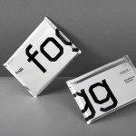
By purchasing overcapacity from international telecom networks, Fogg Mobile provides a fixed cost mobile data traffic service for people who want to avoid unexpected roaming bills when travelling abroad. Through the animate and evolving qualities of computer generated imagery and a combination of unbleached paper, stitching, flat coated colour and silver polypropylene, Fogg’s visual identity, created by Kurppa Hosk and developed by Bunch, delivers an interesting physicality and travel utility to a digital service alongside the more conventional technological cues of recurring geometric typographic form.
Read the review here.