La Catería by Firmalt
Opinion by Richard Baird Posted 8 July 2013
La Catería is a San Pedro-based catering company that produces salads, snacks, deserts and pastries for events with a focus on both presentation and quality of ingredients.
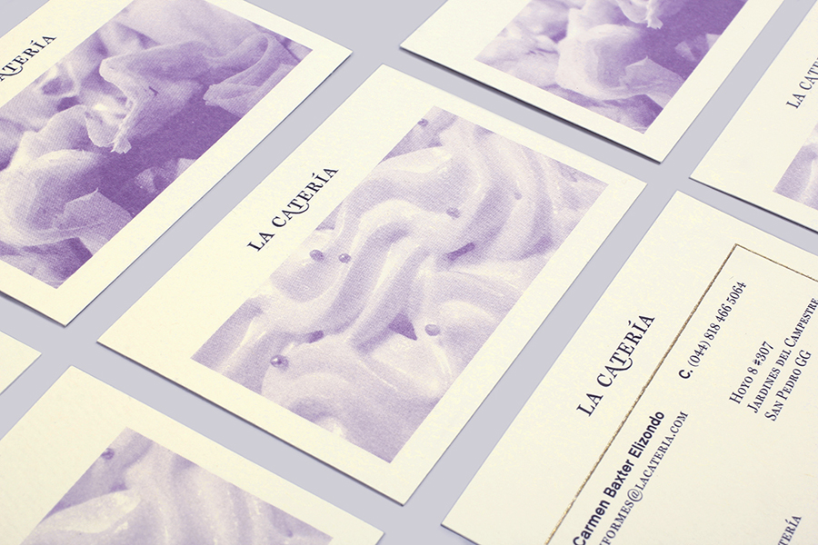
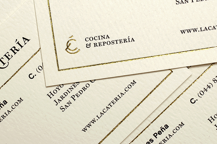
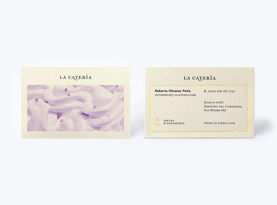
Inspired by small European street markets, “where a variety of textures, styles, forms and colors blend together to create a unique experience that feels warm and inviting”, multidisciplinary design agency Firmalt developed a visual identity solution that includes a logo-type, monogram, tinted photography, a cream textured substrate and block foil print finish to give the brand “classical roots but with a modern execution”.
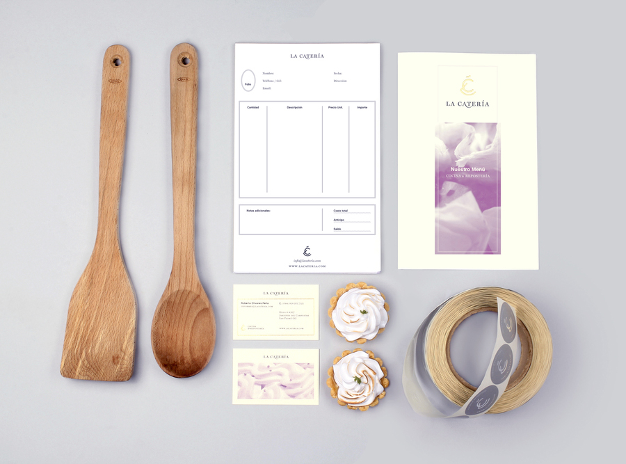
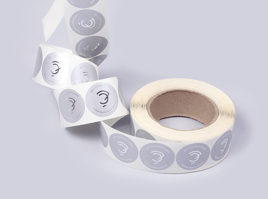
Set in an old style serif, the logo-type’s uppercase letterforms and decent spacing is pretty straightforward in its presentation of experience and professionalism with a custom flourish across the foot of the A that gives it a light proprietary and subtle creative quality. An accompanying mark suitably leverages the personal and crafted origins of the monogram to hint at the care taken in the creation and preparation of the food while its concentric, radial nature and triangular cut, pushing legibility a little around the L, appears like a slice of cake or a stacked desert with a modern, single consistent line weight that feels a little more contemporary.
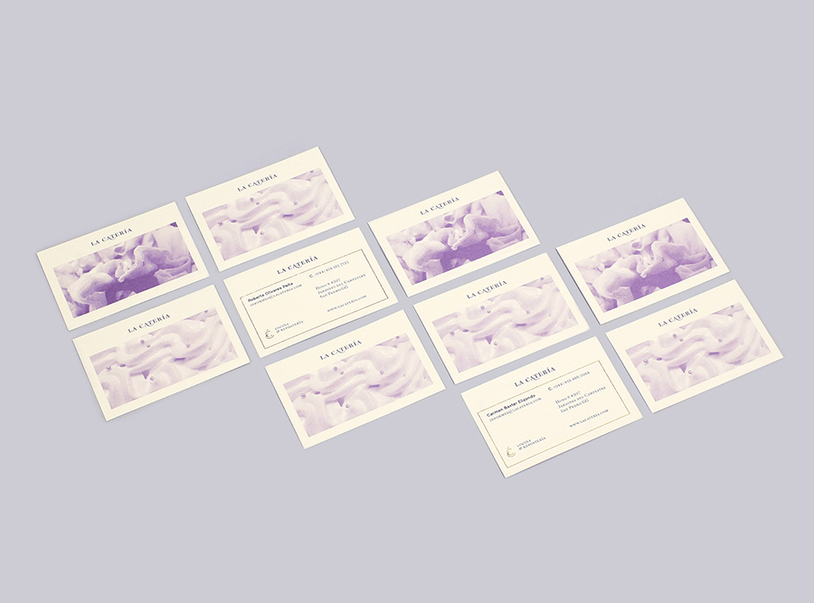
The tinted images provide an on-trend and recent contrast to the type with a good eye for close-up detail and texture, themes emphasised by the physical, tactile qualities of an uncoated and embossed substrate and the classic high quality and perceived luxury of gold foil borders.

Firmalt’s solution has a small, bespoke quality rather than one of commercial or corporate efficiency with a colour palette that borders on but just about avoids 70’s kitsch, lending it a distinctive and familiar quality alongside an appropriate and communicative use of material, print finish, image and type. Be sure to click the images to get a closer look at the detail.
