October’s Top 5 Projects 2013
Opinion by Richard Baird Posted 1 November 2013
October highlights included work by Freytag Anderson for Partick Dental and The Fableists, a brand identity project by Graphical House for interior design studio Noam, Mind’s visual identity solution for fashion label Feral Sphere, as well as new packaging work from Studio In and Spin.
However, there were five projects that really stood out for me which have made it into BP&O’s top five, a feature that brings together what I believe to be the most interesting of the month for another opportunity to be seen and shared. These include flexible identity projects from Two Times Elliott and Bond, illustrative packaging by Marx, Neue’s work for Norway’s meteorological institute and the material and print finish of Perky Bros’ packaging for coffee roaster and cafe No. Six Depot.

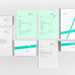
MDD9 is a Hong Kong and London based multidisciplinary architectural and interior design studio, founded in 2009, that is engaged in a variety of building and construction projects that include new developments and renovations, urban planning, lighting, landscape and acoustic design. The studio’s visual identity, developed by Two Times Elliott, reflects the “dynamic outlook” of the individual architects as well as their collective and holistic interior and exterior approach, through a flexible typographical concept and material contrast, one that achieves both a communicative and aesthetic impact.
Read the review here

“The Finnish Academy of Fine Arts, Sibelius Academy and Theatre Academy Helsinki merged in the beginning of 2013 into the University of the Arts Helsinki. Bond created the complete branding solution for the new university. The strategy for the identity was to create a distinctive set of logotypes based on a common design language, and to introduce an anchor symbol that acts as a point of connection between the university mother brand and the three academy brands. The simple and bold ‘X’ has plenty of meanings, just like art does. The symbol can be seen, for example, as a starting point, a destination, a meeting place, a location, a signature, an unknown force, a warning, an irritant, a question and a solution.” – Bond.
See more here

F. Whitlock & Sons is a New Zealand based producer of pickles and sauces with a heritage that dates back to 1877, a heritage that over the last century had disappeared from the packaging. Design studio Marx, working in collaboration with Running with Scissors, sort to bring back and celebrate this with a mix of copywriting wit and illustrative authenticity based around Fred Whitlock’s love of hunting, an approach taken to tap into the ‘dormant frontier huntsman and mischievous child within’, and establish a more contemporary and emotive brand character set within the context of a significant history.
Read the review here

“No. Six Depot is a family owned, small-batch coffee roaster and café nested in the beautiful Berkshires. Located in a historic train station on 6 Depot St, they serve teas, salts and coffee from small farms and roast on location. Their identity, designed by Perky Bros, “juxtaposes a mix of unique rural and modern elements — drawing inspiration from their own backyard railroad and unique approach to keeping it simple and making it true.”
Read the review here

Meteorologisk Institutt provides meteorological data to Norway’s military, civil services and the general public with the intention of safe guarding life, property and the environment. Design agency Neue recently developed a new visual identity solution for the institute that mixes geometric shapes, material and print choices and the detail of photography to achieve communicative and aesthetic contrast and capture the data drawn from the harsh Nordic weather and the impact its gathering has on the people of the country.
See more here