Best Awards Winners

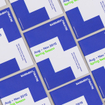
The International by Studio South
The International is a new apartment complex, located not far from Auckland’s Albert Park, with 88 luxury residencies. The building, a repurposed former office, is currently being transformed into an iconic structure with a contemporary exoskeleton of elongated beams. To promote the building and help sell apartments off-plan, the graphic designers at Studio South worked with the developer behind The International...

The Practical Man by Garbett
The Practical Man is an online retail destination for men’s sports style and fitness, activewear and equipment, but also editorial content that covers reviews, fitness-focused travel guides and in-depth insight into new brands. It curates a catalogue of world-leading products that exist at the intersection of fashion and sports performance, designed by innovative and passionate brands with progressive approaches. Australian graphic design studio Garbett worked with The Practical Man...
Basement Theatre by Studio Alexander
Basement Theatre is an independent, underground, community theatre located on Auckland’s Lower Greys Avenue. It was established in 2008 as a place to showcase new voices, fresh perspectives and emerging young talent, and to provide these with the space to develop their performances. The theatre has played host to dancers, visual artists, poets, musicians, comedians and everything in between. Taking their...
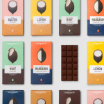
Loving Earth by Round
Loving Earth is an Australian business, established in 2007 by Scott Fry and Martha Butler, that produces a variety of chocolates, snacks, cereals, butters and spreads. All of Loving Earth’s products are made from high quality, organic and fairtrade ingredients, and include ranges that are gluten, grain, dairy and sugar-free. Although taking advantage of a growing multi-million dollar industry, Loving Earth’s values are...
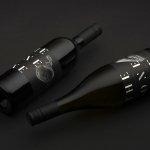
The Bone Line by Inhouse
The Bone Line is a New Zealand winery with a name that references the K—T Boundary, a thin band that runs close to The Bone Line’s location in the Waipara Valley, and that marks the end of the Mesozoic Era and the extinction of the dinosaurs. Auckland based graphic design studio Inhouse worked with the winery to establish a distinctive packaging and identity treatment. Like...
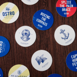
Seafarers & Ostro by Inhouse
Seafarers is a recently rejuvenated seven floor habour front building located in Auckland’s Britomart precinct that will house, over two floors, Michelin starred chef Josh Emett’s flagship restaurant, due to open in stages throughout 2014, as well as brasserie and bar Ostro. The brand identity for the building, restaurant and brasserie, developed by Inhouse, draws on the rich history of the space—once known as...

Saxton Cider by Supply
Saxton is a new range of ciders from New Zealand brewery McCashins developed for fresh food retailer Woolworth’s, Australia. The products identity and packaging, developed by Supply, utilises a classic 17th, 18th and 19th century botanical fruit print and engraving illustrative style to communicate a hand-crafted sensibility....