Designed in California
Goldmine Gummies by Robot Food
While cannabis products still make up a sector overmuch in its infancy, it’s one that’s already birthed its fair share of design cliches – from Camden Market-leaning leaf designs to ‘millennial pink’ trendiness to branding that owes way too much to adjacent sectors, like D2C beauty products or ultra-minimal pharmaceuticals. This recent work from Robot Food, however, manages to demonstrate...
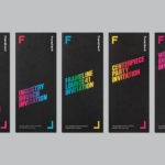
Frameline 41 by Mucho
Frameline is an American nonprofit arts organisation and the world’s longest running LGBTQ film festival. Frameline continues its mission, since its founding in 1977, to change the world through the power of gay cinema, and to connect filmmakers with audiences locally and internationally. Graphic design studio Mucho worked with Frameline on its visual identity and campaigns for its 40th and 41st LGBTQ...
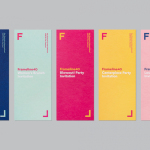
Frameline 40 by Mucho
Frameline is a San Francisco-based nonprofit arts organisation and LGBTQ film festival that intends to change the world through the power of gay cinema, and to connect filmmakers with audiences locally and internationally. Graphic design studio Mucho worked with Frameline on its brand identity and campaign for its 40th LGBTQ film festival, delivering a system based around a framing device, a bright and diverse colour palette and...
Playground by Character
Playground is an American venture fund and start-up studio that takes a hands-on approach to mentoring the next generation of entrepreneurs. It was established with the intention of removing typical operational burdens associated with product development, drawing on the first-hand experiences of its four founders, freeing entrepreneurs to focus on what makes their idea great. Playground not only funds new ventures but offers...
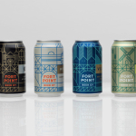
Fort Point Beer Co. by Manual
Fort Point is a San Francisco-based small batch craft beer company that references traditional styles yet is firmly rooted in the present, and has a philosophy that values craftsmanship and innovation, creativity and technique. In 2015, working with local graphic design studio Manual, Fort Point launched a new graphic identity and packaging system to unite its expanding range. Fort Point’s forward-thinking, fast-growing...
Mita Chocolate Co. by Moniker
Mita is an artisanal bean to bar chocolate business grinding and moulding on a single site in Bogata, and sourcing its beans from across Venezuela, Peru, Ecuador and Colombia. Mita worked with San francisco based graphic design studio Moniker to create a visual identity and package design system that would easily scale as new products are introduced....
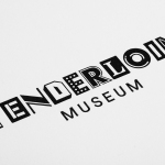
Tenderloin Museum by Mucho
The Tenderloin Museum tells the story of, and celebrates, the people and rich history of the Tenderloin district, a 31 block region of San Francisco. The museum’s permanent exhibition covers the area’s rebuilding, from 1906, following the great earthquake, until the present, and captures its diversity. It is a neighbourhood that has been filled with, what Mucho, the graphic design studio behind the...
Tina Frey Designs by Mucho
Tina Frey is an American homeware designer with a studio in San Francisco. She is inspired by the fluid lines of the sea, the curves and contours of nature, objects picked up while traveling, and the translucent colour of ice lollies and jelly beans. The design of each of her products—which include plates, bowls and utensils—is rooted in simplicity and functionality. These are sculpted...
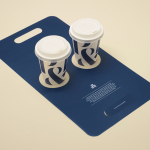
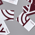
Pablo & Rusty’s by Manual
Pablo & Rusty’s is a small-batch coffee roaster, wholesaler, retailer and cafe with four locations in and around Sydney, and a company culture passionate about sustainability and the pursuit of perfection. San Francisco based studio Manual created a visual identity for Pablo & Rusty’s that would better reflect their values, was sensitive to local coffee culture and is described as having a level...
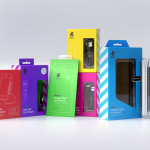
uBear by Hype Type Studio & Mash Creative
uBear is a high-end mobile phone, tablet and laptop accessories business located in Los Angeles, California. Their visual identity, developed by Hype Type Studio and Mash Creative, included a new logo, stationery set, packaging and responsive website. By utilising the bold graphic detail of diagonal stripes, sans-serif type, a bright and diverse colour palette, fine diagrammatic illustration, foils and varnishes and a simple bear...