Designed by Atipo
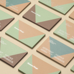
Mamen Diego by Atipo
Spanish graphic design company Atipo recently worked with Madrid based architecture and interior design studio Mamen Diego to create a new brand identity treatment that would extend across and unite a variety of print and digital assets. These included business cards, stationery, brochure and website. Although there is not much information about the philosophies or positioning of Mamen Diego—their new website is yet to launch...
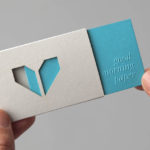
Minke by Atipo
Minke is a Spanish print production studio that favours ‘analogue splendour’ over mass manufacture, providing its clients with a variety of small-scale, mechanical and handcrafted processes and print finishes. Their visual identity, developed by multidisciplinary design studio Atipo, reflects this philosophy and service through a mix of traditional and contemporary detail split across type, colour, material texture, print finish, pattern and die cut...
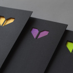
Minke by Atipo
Minke is a Spanish print production studio that favours ‘analogue splendour’ over mass manufacture, providing its clients with a variety of small-scale, mechanical and handcrafted processes. Their visual identity, developed by multidisciplinary design studio Atipo, reflects these services, processes and philosophy through a union of traditional and contemporary detail that exists across type, colour, material texture, print finish, pattern and die cut...
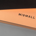
Mi&Mall by Atipo
Mi&Mall is an online shopping destination and resource that brings together and supports small to medium designer brands for people interested in fashion, trends and exclusive collections. Based around a simple logo-type, ampersand, a pale colour palette and a tactile print and material choice, Mi&Mall’s visual identity, created by Spanish multidisciplinary design studio Atipo, mixes high fashion and boutique craft...