Fonts in Use: Duke Fill
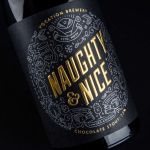
Vocation Brewery Limited Edition by Robot Food
Vocation is a UK microbrewery, established and run by John Hickling, with a range of craft beers described as having distinctive and punchy flavour profiles. Communicating the brewery’s unique personality and the crafted quality of its range rested in the hands of UK based graphic design studio Robot Food. Drawing on the beer’s tropical, fruity, floral and hoppy characteristics, the brewery’s fearless, daring and renegade attitude, and the...
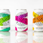
Vocation Brewery by Robot Food
Vocation is a UK microbrewery, established and run by John Hickling, with a range of craft beers that have distinctive and punchy flavour profiles, and a visual identity, packaging design and naming convention created by Leeds-based studio Robot Food. This draws on the tropical, fruity, floral and hoppy characteristic of the range, and the brewery’s fearless, daring and renegade attitude. This post was updated March...