Broadgate by dn&co
Posted: Filed under: Fonts in Use, Logo Reviews, Property | Tags: Animated Logos, Brand Identity, Brand Identity Reviews, Branding, Branding & Packaging of 2018, Branding Blog, Branding Reviews, British Design, Business Card Design, Colour in Use: Pastels, Design Blog, Design For Print, Design News, Design Opinion, Design Reviews, Designed by dn&co., Designed in London, Fonts in Use: Euclid Flex, Form Language, From the United Kingdom, Generative Logos, Graphic Design, Graphic Design Blog, Hoarding Design, Logo Design & Branding Blog, Logo Design Inspiration, Logo Design Resource, Logo Designs, Logo Opinion, Logotypes, Place Branding, Sans-serif Typography, The Best Business Cards of 2018, The Best Graphic Design Work of 2018, The Best Logo Designs of 2018, The Very Best Brand Identities of 2018, The Very Best of 2018, Type Foundry: Swiss Typefaces, Typography, Wordmark Design Comments Off on Broadgate by dn&coOpinion by Richard Baird
Broadgate is the largest pedestrianised neighbourhood in Central London. It is adjacent to the busy transport hub of Liverpool Street station, surrounded by Shoreditch, Spitalfields, Old Street and the City, made up of a diverse community and uses that span innovation, finance, food, retail and contemporary cultural activities.
The area will receive a £1.5 billion investment to further its development as a world-class mixed-use destination. This will include 4.9 million sq ft of new and redefined workplaces, retail spaces, public areas and restaurants described by dn&co., the design studio behind Broadgate’s graphic identity, as embodying the community and feel of the historic piazza with the energy of modern London.
Broadgate connects and contains diverse areas, each with their own unique character, services and experiences, and will go on to include many more. Wrangling these into a singular coherent identity, one that is inclusive yet with a definitive identity and without the preconceptions of typical B2B communications was a critical part of the challenge. This was achieved through a generative and kinetic B; a dynamic and constantly shifting container and outline. This motif, alongside a contrasting dark and light colour palette and complementary type treatment, serve to unify posters, business cards, tote bags, website, installations, social media profiles and merchandise.
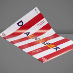
Edvard Munch High School by Snøhetta, Norway
Posted: Filed under: Education, Logo Reviews | Tags: Brand Identity Reviews, Branding Blog, Branding Reviews, Business Card Design, Custom Typefaces & Logotypes, Custom Typography, Design For Print, Design Opinion, Design Reviews, Designed by Snohetta, Fonts in Use: Euclid Flex, From Europe, From Scandinavia, Graphic Design, Graphic Design Blog, Logo Design & Branding Blog, Poster Design, Sans-serif Typography, Stationery Design, The Best Brand Identities of 2015, The Best Business Cards of 2015, Tote Bag Design, Type Foundry: Swiss Typefaces, Typography, Uncoated Papers & Cards Comments Off on Edvard Munch High School by Snøhetta, NorwayOpinion by Richard Baird.
Edvard Munch High School provides students with a broad programme of study, with a particular focus on creative classes such as music, dance, product design and textiles, in conjunction with core academic subjects. Classes are given in a newly refurbished, early 20th century building, and the former home of the Oslo National Academy of the Arts.
To coincide with the refurbishment, the school also launched a new brand identity system, created by Norwegian graphic design studio Snøhetta, and based around theme of duality and the concept perspectives, a reflection of the school’s academic and creative programme, versatility and knowledge. This extended to posters, business card, brochure, tote bag and signage, some of which feature a folded, three-dimensional, interactive component.