Fisix designed by Mucho
Posted: Filed under: Fitness, Health and Beauty, Fonts in Use, Packaging Reviews, Sport | Tags: Amber Glass and Plastic Packaging, Best Packaging Designs, Branding, Cosmetic Packaging, Design News, Design Opinion, Design Reviews, Designed by Mucho, Fonts in Use: Austin, Fonts in Use: FF Kievit, Packaging Design, Packaging Design Blog, Packaging News, Pastel Colours, Serif Logotypes, Sport Logos and Packaging, The Best Packaging of 2013, Type Foundry: Commercial Type, Type Foundry: FontFont Comments Off on Fisix designed by Mucho
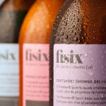
Fisix is a line of cosmetic products that includes shower gels, shampoos and hydrating skin balms, developed by four marathon running friends who ‘couldn’t find a range that met their needs as sportsmen’, branded and packaged by multidisciplinary design agency Mucho.
Mucho’s design solution unties the diagrammatic, geometric forms and typographical, sans-serif utility and neutrality of the pharmaceutical and sports science industries with the subtle fashion and on-trend design sensibilities of a tightly spaced, lowercase serif logotype, italics, and a flat, economical, unisex grey and pastel colour palette. A smart balance of formulated effectiveness and the more exclusive, restrained qualities associated with high fashion and professional cosmetics.
F. Ménard designed by Lg2boutique
Posted: Filed under: Logo Reviews | Tags: Agriculture Logos and Packaging, Bag Design, Brand Identity Reviews, Branding, Brochure Design, Business Card Design, Design For Print, Design News, Design Opinion, Design Reviews, Designed by lg2boutique, Designed in Montreal, Designed in Québec, Fonts in Use: Brothers, Fonts in Use: FF Kievit, Fonts in Use: Vitesse, Graphic Design, Heritage, Logo Design & Branding Blog, Logo Designs, Packaging Design, Serif Logotypes, The Best Brand Identities of 2013, The Best Logo Designs of 2013, Tinted Photography, Typography Comments Off on F. Ménard designed by Lg2boutiqueF. Ménard is a Canadian pork producer and butcher with a family heritage that dates back fifty years. Their visual identity, developed by brand and packaging design specialist lg2boutique, creates a seamless fusion of a past and present – traditional service values alongside contemporary high standards – through the union of vintage and contemporary photography, the utilisation of digitised, early 20th century typeface and a flat, economical colour palette cohesively executed across a variety of collaterals.