Type Foundry: Font Bureau
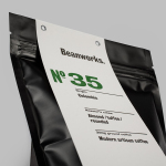
Beanworks by Paul Belford Ltd
Beanworks is a UK wholesale coffee roaster and supplier, coffee machine specialist and barista training school. It prepares its beans using a customised vintage Italian drum roasting machine that allow it to digitally monitor process, and produces a range of single and multi-origin coffee varieties. Although the roaster embraces contemporary artisanal coffee culture, when it comes to naming conventions it favours the utility of numbers,...

30 Park Place New York by Mother Design
30 Park Place is a private residence with 82 floors and 157 apartments created by the internationally renowned luxury hotel and resort management chain Four Seasons. Located in Tribeca, New York, the residences are described as having breathtaking views, soaring ceilings, multiple exposures, and warm details, as well as five-star hotel level services and amenities that include swimming pool, fitness centre, private dinning experience and...
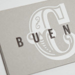
Buena C by Tres Tipos Gráficos
Buena C is an event planning agency, founded by Carolina Arjones, with offices in Madrid and Alicante. The agency provides both individuals and businesses with exclusive, individualised and detail orientated event consultation and organisation services that include, but are not limited to, sourcing locations, photographers, catering, stationery, transportation and accommodation for presentations, conventions and weddings. Alongside event planning the agency...