Grids and Guides
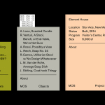
MOS Architects by Studio Lin
MOS is an American architectural practice that mixes playful experimentation with serious research. The practice, as it exists now, following two years of what seems to be an informal approach, was established in 2005, and has worked through a range of design experiments it describes as a make-believe of architectural fantasies, problems, and thoughts on what the practice would be building in the...
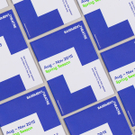
Basement Theatre by Studio Alexander
Basement Theatre is an independent, underground, community theatre located on Auckland’s Lower Greys Avenue. It was established in 2008 as a place to showcase new voices, fresh perspectives and emerging young talent, and to provide these with the space to develop their performances. The theatre has played host to dancers, visual artists, poets, musicians, comedians and everything in between. Taking their...
Fundació Joan Miró 40th Anniversary by Mucho
Fundació Joan Miró is a cultural centre located on Barcelona’s Montjuïc hill. It was opened in 1975 as a place to encourage young artists to experiment with and exhibit contemporary art, and would allow the general public better access to new work of the time, which it continues to do today. Fundació Joan Miró has a distinctive exterior structure of modular geometric prefabricated surfaces, extrusions, recesses...

Biber Architects by Spin
Biber Architects is the New York based practice of teacher, author, architect and former Pentagram partner James Biber. Biber is made up of a tightly organized, highly experienced, and efficient team that have been producing design-led work—where others are process-focused or ideologically orientated—for more than 25 years. The practice was conceived as a place to tackle architectural work from a fresh perspective,...
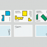
Poseidon Helsinki by Kokoro & Moi
Poseidon Helsinki centralises the tasks of architect and builder with the intention of delivering higher quality construction projects based around visionary and uncompromising design solutions. Poseidon’s values are deeply rooted in a love for Helsinki, a belief in aesthetically ambitious architecture and expansive urban spaces, and improving the capacity and quality of the city through sensitive renovation and attic conversions. Poseidon’s visual identity, inspired...
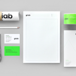
Griab by Kollor
Griab is a Swedish engineering firm, founded in 1957 and located in Helsingborg, Sweden, that specialises in delivering a holistic design and build service that includes land planning, wastewater management, architecture and construction. Developed by multidisciplinary design agency Kollor, Griab’s visual identity, “inspired by the the straight lines and shapes commonly seen in architecture” and created to help reinforce the firm’s environmental...
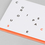
Curious Space by Mash Creative & May Ninth
Curious Space is a London-based scenographers—a specialist scene setter—that creates “unique and inspiring spaces for museums, galleries and more”. Their visual identity, developed by Mash Creative and May Ninth, ‘splits apart to create a physical space that intrigues whilst the type can sit either horizontally or vertically in numerous layouts within the dotted grid”, establishing a flexible and unusual yet structured...
Tegn_3 by Neue
Tegn_3 is a Norwegian, multidisciplinary, architecture design studio that, through inclusive methods, process-oriented and competent project management, deliver holistic solutions that encompass the fields of architecture, planning and landscape, to large clients across Scandinavia. Their visual identity, developed by Neue, draws together the themes of technical knowledge, structure, connections, collaboration and creativity through neutral typography, a modular and expanding geometric...
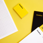
Kinetica by Face
Kinetica is an international industrial design studio located in Santa Catarina, Mexico, that specialises in non-standard architectural projects. Their new visual identity, created by ‘supermodernist’ design agency Face, utilises a bold black and yellow colour palette, a straightforward sans-serif logo-type, plenty of space and a grid based collateral layout to establish a restrained and contemporary interpretation of heavy industry infused with subtle architectural cues....
Ideo Architekci by For Brands
Polish design studio For Brands (formerly Artentiko) have published images of their latest visual identity project commissioned by Wrocław based architectural studio Ideo Architekci. Based around a modular and dynamic grid based framework, modernistic typeface and a bright industrial colour palette, Artentiko’s solution manages to capture the fundamental aspect of architectural planning and a consistent but expansive approach....
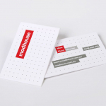
Modhouse by A Friend Of Mine
Modhouse is an Australian design and building firm that specialises in sustainability, modular construction techniques and interior design. The company’s new brand identity, created by holistic design studio A Friend Of Mine, visualises their specialist approach with a set of elemental and geometric containers, bold sans serif typography and a colour palette that juxtaposes bright creative colours with warm architectural greys....

Sellar by Campbell Hay
Sellar Development is a privately owned property investment, development and management business based in London and responsible for such high profile projects as The Shard and London Bridge Place. The company approached brand design agency Campbell Hay to develop an identity that would reflect their ongoing partnerships, collaborative process and involvement with the architectural world....