Hand Painted Signs
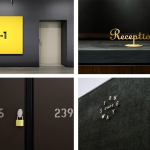
BP&O Collections – Signs & Wayfinding
A continually updated collection of signage and way finding designed for museums, galleries, shops and bars, as part of a new brand identity, and published on BP&O. Between them, these how a mix structure, type and iconography, material choice, surface finishes, colour and contrast can stand out, communicate and direct. This selection features window decals, illuminated panels, neon tubes, standalone and wall mounted...
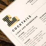
Libertine Liquor Bar by CODO
Libertine is a bar and restaurant, located on Indianapolis’ Mass Avenue, that celebrates the pioneering American spirit with an emphasis on classic cocktails, craft distillers, boutique wines and an evolving menu. It is recognised as one of the best restaurants and bars in the country, and as being instrumental in the city’s growing and continued support of local food and independent...
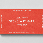
Stone Way Cafe by Shore
Stone Way Cafe, formerly the Tiny Ninja Cafe, is a Seattle based neighbourhood meeting point, music venue and internet cafe, in the area of Fremont, with a formidable, geometric, concrete exterior structure and a warmer interior of wood surfaces created by goCstudio. Design studio Shore, working closely with signwriters and fabricators, created a brand identity treatment for the cafe, which included...