
Etxe by Blok
“Etxe is a small, innovative industrial design studio based in Mexico City. Their philosophy is to design to the very essence of a product. There is no room for extraneous elements; they believe that the beauty and artfulness of a product lies in its purest functionality. The identity itself is thus a distillation of their unique approach.” – Blok...
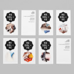
Resolve by Neue
Resolve is a Norweigen provider of a broad selection of cleaning and restoration services to both the commercial and private clients covering asbestos removal, fire and water damage mitigation and ventilation cleaning. Their new identity, designed by Oslo based Neue, rejects that hard industrial aesthetics of the sector in favour of a softer, people led proposition....
Architecture PLB by Sea
Architecture PLB is a design-led practice working across both the public and private sectors with offices in Winchester and London. Their new brand identity, designed by communications agency Sea, unites the three dimensional aspect of the architectural world and a sense of sculptural creativity with a gradated ‘A’ logomark and the utility and corporate neutrality of a well-spaced, light grey san serif...
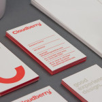
Cloudberry by Perky Bros
Cloudberry is a New York-based interactive design firm that specialises in simple and intuitive on-line experiences for both the financial and healthcare sectors. Brand design agency Perky Bros – commissioned to develop Cloudberry’s visual identity and website – created an abstract smile like logo-mark to resolve and express the simplicity of ideas, the positive impact these have on Cloudberry’s clients and...