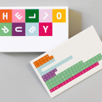
Hello Ruby by Kokoro & Moi
Hello Ruby is a Scandinavian company that offers an accessible and playful way for children to learn about technology, computing and coding, guided by Ruby, an illustrated character, and her animal friends. Founded in 2009, with the intention of being a small art project, and initially limited to a book, Hello Ruby has rapidly grown into a popular and comprehensive children’s computing...
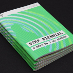
STRP Biennial 2015 by Raw Color
STRP brings together art, technology and experimental pop culture, and connects these to a broad audience, and through its light art, interactive art and robotic performances, lectures, workshops, music and film events, offers a glimpse into the future. This culminates with the STRP Biennial, an indoor art and technology festival that provides visitors with an opportunity to experience the extent to...
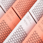
Sushi & Co. by Bond
Sushi & Co. is a restaurant and cafe on-board a cruise ship taking guests to destinations along the Baltic Sea. It has a modern interior design that mixes dark and light wood furniture, features warm low hanging lights, organic patterned upholstery, cool grey walls, exposed brick panels, slate floors and a visual identity developed by Helsinki based graphic design studio Bond. Extending...
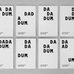
Dadadum by Demian Conrad Design
Dadadum is a Swiss contemporary furniture brand created out of respect for and in homage to the functionality, technical expertise and minimalism associated with Swiss design, and that strives to bring out the beauty of each raw material. The brand draws on the ‘talents of local designers who have made an international name for themselves and whose specifications are to re-establish the notion of Gute...