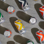
Detour Beer Co. by Weave
Craft beer has become a hugely competitive market to enter. It seems a rather obvious thing to write, but it’s quite something to have been part of the generation that saw its rise. It’s also provided a lot of great imagery for design blogs, and moved freely between both brand building and just plain visual delight. To see large fridges within...
NN North Sea Jazz Festival by Studio Dumbar/DEPT
After seeing Collins’ work for the San Francisco Symphony – a pioneering typographic and digital experiment with Swiss foundry Dinamo – I thought it would be some time before I’d be surprised by another visual identity in the music space. Sure, there’s an abundance of styles and artists to be inspired by within an art that has evolved in tandem...
Future Circular Collider by Bleed
After the scientific successes of CERN’s Large Hadron Collider (and its blessed failure to create any world-destroying black holes), the research organisation has an even greater need for speed. The team of scientists over in Geneva has been illuminating the nature of our universe since 2009: accelerating and smashing particles together, then snatching glimpses of their tiny collisions. Their appetite...
Big C Charters by Mucho
Big C Charters is a premier charter service located in the San Francisco Bay Area, offering hands-on fishing trips and excursions. The company gets its name from Christian Cavanaugh, captain, founder and former professional basketball player. With a growing fanbase and fleet, Mucho was commissioned to create a new logo, colour palette and custom typeface for the brand, as well...
BP&O Voices
Paul Belford on Ads:
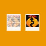
Polaroid press ad
A guest article from Paul Belford on Doyle Dane Bernbach’s press advert for Polaroid (1980). BP&O Voices presents the opinions of industry experts on a wide range of topics....
BP&O Voices
Seth Rowden on Brand Language:
Farmyard Frozen – Vibrant language to brighten up your freezer
A guest article from Seth Rowden on Farmyard Frozen’s brand language. BP&O Voices presents the opinions of industry experts on a wide range of topics....
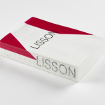
ARTIST | WORK | LISSON by Irma Boom
It’s rare that an art book comes with a personal story. As we ease ourselves into this new strand of the Voices column and as we begin to get to know each other, let me share one with you. I first discovered ARTIST | WORK | LISSON on a shelf in the office at Whitechapel Gallery and thought it was...
San Francisco Symphony by Collins
Formed in 1911, while San Francisco was rapidly rebuilding after the devastating earthquake of 1906, the San Francisco Symphony (SFS) has been serving audiences in the Bay Area and beyond for 111 years. In 2018, Esa-Pekka Salonen – a Finnish conductor and composer – was announced as the incoming musical director, with his tenure to start during the fall season...

Girl Scouts of the USA by Collins
Not just a patch, but a full patchwork. Collins has injected ‘fashun darling’ into a club that has collected aesthetic cobwebs over the past few decades. The Girl Scouts of the USA has finally been ripped from old-world rigidity into a brand with whimsey. A reset for now, and a lifestyle brand for tomorrow. Scouts is the sort of extra-curricular...
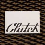
Clutch Automotive by Parker Studio
From à la mode Lick paint to gramable Aokka coffee, everything comes in a tin these days. The rise of metal packaging solutions in food and beverages, healthcare, household and consumer is expected to accelerate by 3.1% year-on-year from 2021 to 2030, driven by the demand for sustainable alternatives to plastic and lightweight substitutes for glass. Aesthetically speaking, the tin...
BP&O Voices
Paul Belford on Ads:
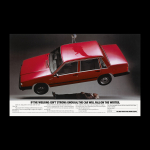
Volvo 740 ad
A guest article from Paul Belford on AMV’s advert for the Volvo 740 (1983). BP&O Voices presents the opinions of industry experts on a wide range of topics....

BP&O Voices
Seth Rowden on Brand Language:
Mami Wata – Catching a break with West African folklore
A guest article from Seth Rowden on Mami Wata’s brand language. BP&O Voices presents the opinions of industry experts on a wide range of topics....